Why adopt a visual-first strategy? (part 1)
Part 1 of 3
Visuals have always helped people grasp complex ideas, from medieval bestiaries to Spotify Wrapped. They don’t just present information — they clarify patterns, reveal insights, and drive action. For most (especially large) organizations, they’re a cost-effective strategic advantage.
Shifting to a visual-first strategy is simpler than you think. All it requires is taking a moment to consider how visuals can make what you say, sell, or support clearer (this is easier when you have a Design Strategist to advise).
But what does it really mean?
Visual-first means showing benefits, not just listing features. It’s adding before-and-after visuals to a report to demonstrate impact, summarizing strategy in an explainer video as well as a long email, or mapping out a redesigned workflow that cuts approval steps from 8 to 3 — something far more effective than text alone.
Visual storytelling doesn’t replace words; it enhances them. And while a visual-first strategy may seem like a new or odd idea, its principles are timeless. Whether you’re explaining a process, rolling out innovation, or aligning teams, visual communication quickly cuts through complexity.
Let’s explore breakthrough visualizations that prove the power of information design — classic examples where visual storytelling made the fastest, clearest impact possible, paired with examples of how the frameworks have evolved to be used for other topics.
Visual frameworks create clarity.
Harry Beck’s London Underground Map (1933)
- The challenge: Early London Underground maps were accurate but cluttered.
- The solution: Beck prioritized minimalism and relationships over detail.
- The impact: Navigation became easier, proving clarity beats strict accuracy.
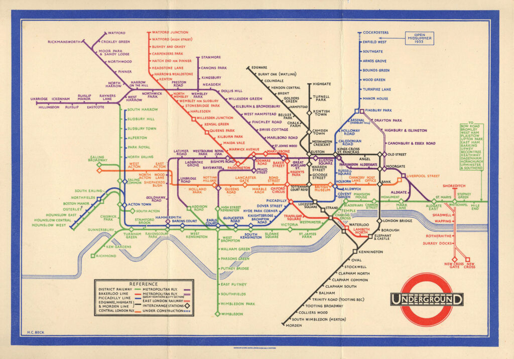
How it started: Beck’s map transformed complex systems into clear, navigable visuals. Instead of geographic accuracy, Beck used color-coded lines and evenly spaced stations that were inspired by electrical circuit diagrams, making the network easier to understand. This important invention makes it clear that sometimes, distorting reality makes information more effective.
His approach extends beyond transit, influencing business, strategy, and communication to this day. Organizations now use subway-style maps to simplify processes, plans, and workflows, clarifying complex initiatives without unnecessary detail.
In corporate strategy and change management, these frameworks help teams visualize employee journeys, decision-making paths, and customer experiences. Others use them to map customer interactions, new processes, and growing ecosystems.
This framework maps all kinds of information — places, data, relationships — making it incredibly versatile. Beck’s legacy proves that visual thinking speeds up and enhances comprehension, whether you’re navigating a city or a business strategy.
Launching a new HR / People Strategy for a Fortune 50 retailer
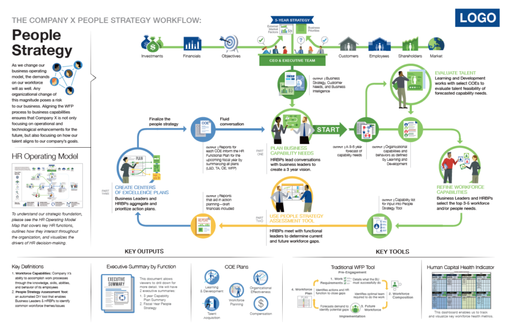
How it’s going: With 200,000+ employees across 2,000+ locations, a Fortune 50 retailer’s Chief Human Resources Officer faced a major challenge: launching its first enterprise-wide People Strategy. But the CHRO’s bullet-heavy PowerPoint deck was uninspiring and confusing, risking disengagement at every level. Who does what now? What’s the new process? What are the inputs and outputs? What am I responsible for? It simply wasn’t clear.
The VP of Organizational Effectiveness called Tremendousness to transform the strategy into a clear, compelling narrative. We created a visual framework — somewhat inspired by Beck’s tube map and its legacy — that mapped the initiative within the company’s larger transformation, making it easier to understand and act on.
The result? Clarity and engagement. The infographic worked so well that executive leadership expanded the partnership, bringing Tremendousness’ capabilities to other parts of the business to visualize operating models, supply chain strategy, and even the overall business model — ensuring that complicated ideas could be delivered with impact.
Visual explanations turn information into insights.
Florence Nightingale’s Coxcomb Charts (1858)
- The challenge: More hospitalized soldiers died from disease than battle wounds.
- The solution: Visual, actionable proof that sanitation reduced mortality.
- The impact: One of the earliest dataviz projects to drive policy change.
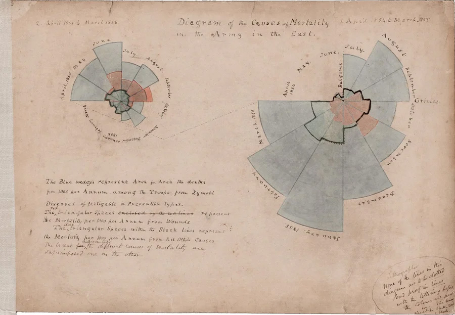
How it started:Nightingale’s charts revolutionized data visualization, making statistics visually compelling and freshly useful. Used to highlight preventable deaths in military hospitals, her radial diagrams influenced public health reforms by emphasizing proportion and impact.
Businesses now apply her approach to data storytelling, using radial charts and other graphs to showcase market trends, performance metrics, and risk analysis. By presenting relative proportions clearly, these visuals make abstract insights persuasive and actionable.
In corporate strategy, coxcomb-style charts illustrate resource allocation, customer segmentation, or operational efficiencies, helping stakeholders grasp key data quickly. Marketing teams use them for audience analysis, engagement metrics, and brand positioning, turning numbers into narratives.
Nightingale’s work, built on past innovations by William Playfair and leading to future innovations by W.E.B. Du Bois and his students — proves that effective data visualization enhances decision-making, ensuring key insights are seen and understood.
“STL Progress to 2030” for Greater St. Louis, Inc.
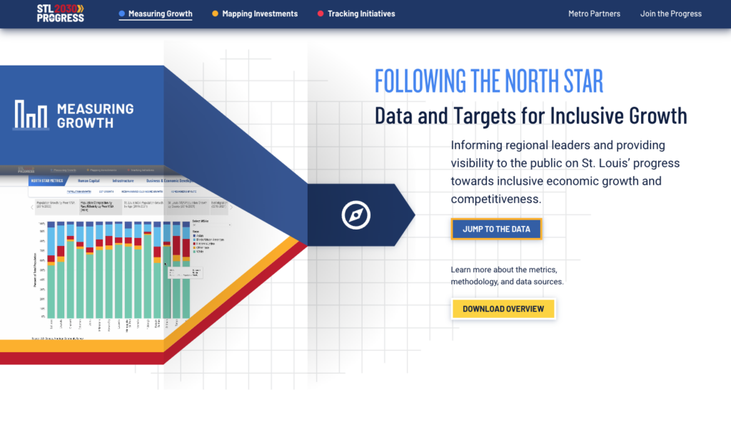
How it’s going: A couple years ago, Greater St. Louis needed a compelling, data-driven toolkit to track progress on its STL 2030 Jobs Plan. The challenge was clear: How do we measure success?
Tremendousness collaborated with stakeholders, data analysts, and GIS specialists to shape complex data into an intuitive, engaging format. Through discovery sessions and rounds of UX, visual, and interactive design, we created a bold, dynamic web experience that connects strategic growth efforts to real-world impact.
The final site features 60+ charts, nearly 400 capital projects, and 125+ strategic initiatives, all supported by a custom CMS and automatic Tableau / ArcGIS updates. Launched on time and on budget, STL Progress to 2030 debuted at the Inclusive Economic Growth Summit, earning recognition from The Brookings Institution as a model for regional progress tracking.
Visual storytelling makes sense of complexity.
Fritz Kahn’s “Man as Industrial Palace” (1926)
- The challenge: Interest in science was growing, but anatomy is exceedingly complex.
- The solution: Newly familiar industrial metaphors helped make biology more understandable.
- The impact: Revolutionized scientific storytelling in design, medicine, and education.
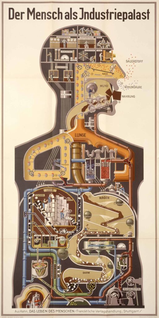
How it started: In 1926 Kahn published Man as Industrial Palace, an iconic cutaway infographic depicting the human body as a factory. Using mechanical metaphors in a “cutaway” view, it illustrated organs as industrial components — lungs as bellows, the heart as a pump, and the brain as a control center — making biological processes more relatable.
Kahn’s work pioneered modern infographic storytelling, blending text and visuals to enhance understanding while reflecting the era’s fascination with mechanization.
Beyond science and education, business and industry have adopted Kahn’s approach to explain complex systems through metaphorical visualization. His influence is seen in process mapping, workflow diagrams, and supply chain visualizations, where abstract functions are represented as interdependent machinery.
Companies use similar techniques in corporate strategy, product development, and operational planning, breaking down intricate processes into digestible, visual narratives. Kahn’s legacy continues to shape data storytelling, branding, and innovation roadmaps, proving that metaphorical thinking remains a powerful tool for communication.
“Shedding Light on Smart City Privacy” for Future of Privacy Forum
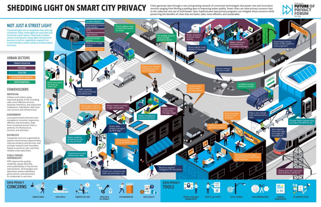
How it’s going: Modern cities generate massive amounts of data through an expanding network of connected technologies. From parking apps and traffic sensors to water quality monitors, these innovations improve efficiency, sustainability, and quality of life. But while smart city technologies offer countless benefits, they also raise privacy concerns—issues that can be addressed with robust data protection programs that balance innovation with security.
The Future of Privacy Forum (FPF), a Washington D.C.-based nonprofit advocating for privacy leadership and transparency, needed a way to illustrate the complexity of smart cities. Instead of a traditional report, we collaborated on an interactive microsite with a downloadable infographic. The final pieces present a futuristic yet realistic depiction of a smart city using cutaways, broken into key categories:
- Urban sectors using smart technology
- Technology enablers driving these innovations
- Stakeholders impacted by or delivering smart solutions
Users can explore the city by hovering over specific markers to see how each technology contributes to urban operations. Interactive tabs reveal how different sectors — transportation, utilities, and government — are transformed by smart systems. To complement the digital experience, we also created a static map to illustrate how everything fits together, making complex data more accessible and actionable.
So what does this have to do with work?
Many leaders assume that because information is available, it’s understood. This is a boldly unwise assumption. Throughout history, smart people have used visual tools to inform, engage, and drive action because they know that…
Miscommunication slows things down.
Missed details lead to missed opportunities.
Misalignment costs time and money.
If you’ve got important information to share, just remember that the info itself isn’t always the priority. Information can only inform; it’s the insights that illuminate.
Part of a series:
- This piece — Part 1: Why adopt a visual first-strategy?
- Next in the series — Part 2: Who benefits from a visual-first strategy?
- The closing — Part 3: How do I operationalize a visual-first strategy?
Image of numeral 1 by Marianne Bos / Unsplash.