The essential components of information design* (as I see it)
When you’ve been doing something for a long time, you tend to not always think about what you’re doing. A flow just happens. In our case, you learn, you sketch, you think, you repeat. Ideas come and solutions materialize. Inputs become outputs. Requirements get checked off. Curveballs get thrown and batted away. And sometimes you swing and miss. I’m not saying it’s easy or it isn’t work, but experience usually helps make the process fluid, comfortable, and productive.
The upside to this proficiency is efficiency. I hope you’ve heard the story of how the legendary designer Paula Scher sketched Citi’s logo on the spot. But the important part of that story isn’t those short seconds, it’s the lifetime of experience that led up to that moment.
“It took me a few seconds to draw it. But it took me 34 years to learn how to draw it in a few seconds.”
—Paula Scher, on designing the Citi logo
A downside to experience can be sameness, predictability, laziness—phoning it in. A lack of curiosity. Not being critical enough. Not pushing yourself. Safety. Same ol’, same ol’. Following your rut instead of your gut.
A while back I made myself curious—what have I learned in all this time doing this? Do I have a process beyond the clichéd (yet classic) “Discover | Design | Deliver?” From start to finish, what are the most important things I consider when creating the information-based visuals that Tremendousness is known for?
And finally, could I capture that?
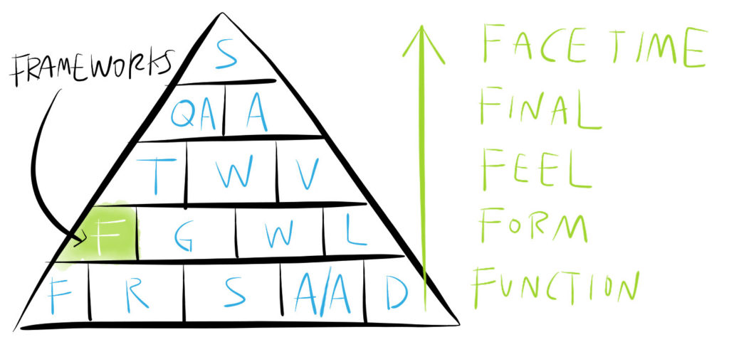
Here’s what I came up with, starting from the bottom up. I know it’s a pretty tactical take, but let’s consider this a first draft and see where it goes. I think I’ll try to dive deeper into each of these things in future posts (we already touched on frameworks a few years ago).
FUNCTION
The foundation: Start with hard questions if you want solid answers.
- Functionality (What’s the purpose? What’s the goal?)
- Relevance (Who’s the audience and what do they need?)
- Story (What’s the content? Is it a narrative, data-oriented, something else?)
- Accuracy & attribution (Can we trust you and your sources?)
- Delivery (What’s the right mechanism—print, video, AR, &c.?)
FORM
The structure: Now build something solid with those answers in mind.
- Framework (The overall visual arrangement and/or metaphor—for example: process, system, comparison)
- Grid (An underlying structure that helps bring rhythm, order, and efficiency to the process)
- Wayfinding (Hierarchy that helps the viewer know where to start and where to go)
- Layout (The basics: scale, contrast, alignment, proximity, white space, &c. as worked out in Napkin sketches & Blueprint designs)
FEEL
The style: Shorts & flip flops? Or a nice suit? Dress the content appropriately.
- Tone (The design vibe the piece gives off—serious, funny, anodyne, quirky, corporate, punk, &c.)
- Writing (The craft and quality of the words that go with the pictures)
- Visuals (The look and feel of the art and design—branding, typography, photography, illustration, color, &c.)
FINAL
The deliverable: Make sure it’s sound—and safe.
- QA (Proof it carefully)
- Archive (Save all source files securely)
FACE TIME
The release: Get it out there, assess how it does, and understand how to do it better next time.
- Share it (Distribute, promote, learn, iterate)
That’s it. I understand this is probably just another way to look at a process that’s been looked at many times before. But it feels right to me. It feels like something I knew but had never captured.
*Information design: When we use this term, we’re using it in reference to our core offerings—high-end infographics and animations that help explain a complex subject. Our work is very illustration-based as opposed to being dataset-oriented. We tell stories. These principles probably also align nicely to graphic design, web design, &c.