Storytelling with data: Improve your data presentations to communicate effectively
Your data has a story to tell. Sometimes, it’s known or obvious. But other times, as you begin to dig into it, you find an entirely new or unexpected story. Here’s how to make the most of it using visual storytelling.
Whenever possible, I try to read the book before I see the movie. Why? Because I want the opportunity to fill in the details myself—to imagine the characters and to build out the world they inhabit based on only the author’s writing. Watching the movie first and seeing some Hollywood multi-millionaire as the protagonist is just not as fun. It takes some of the collaboration out of storytelling by presenting every detail and data point on a silver (screen) platter. All that’s left is to sit back, passively, and watch.
That’s nothing against movies. The great power of film is in how it brings the energy, emotion, action, drama, pacing, and humor of a writer’s words to life. It’s also fun to compare your interpretation to the director’s. In a movie everyone essentially sees the same thing—it makes the story explicit and exact. Often, this is very important and exactly what you need.
This is especially true and important when it comes to storytelling for business. Words or pictures alone obviously carry meaning, but can create ambiguous gaps in the story. Data alone obviously carries information, doesn’t provide enough context. Only storytelling with data wraps everything in a nice package and allows you to present data accurately, and as part of a narrative that’s easier for your audience to understand and appreciate. Because you’ve filled in all the details and brought it all together in a cohesive story-based presentation, your audience sees exactly what you want/need them to see, with no ambiguity.
First things first: dive into data analysis
Regardless of the topic, your data has a story to tell. Sometimes, it’s known or obvious. But other times, as you begin to dig into it, you find an entirely new or unexpected story. Analyzing the data so that these stories get surfaced comes first. To do this, you have to know how to find similarities and differences within a data set (well, someone has to know). When analyzing data, sorting or filtering the data in different ways (geographical, over time, etc.), can give you a fresh perspective. Look for…
- Consistent patterns and relationships between data points or data sets (trends).
- Elements that have obvious relationships to each other (correlation).
- Unusual occurrences in the data (outliers).
Some of the raw data for a NACCHO project. There’s information there, but it’s hard to make sense of.
Next: craft a story from the data using appropriate charts
Think about these questions: What are your main points? Which data support these points? Why should the audience care? What do you want them to do after getting this information?
Outline your story | What are your main points? Now is the time to shape a coherent and concise narrative around the data that compels your audience to take some sort of action. Start with an outline, as this is the best way to begin organizing any presentation. Write headlines for every slide or chunk of content. Include key data and rough concept sketches.
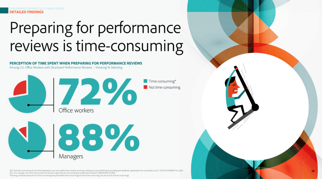
Determine data and chart design | Which data support these points? This is where those key concepts come into play. Trends form the backbone of many data-oriented stories. Below, the predictive bar chart under the big “$70 MILLION” below clearly shows future revenue potential trending upward. That’s powerful and clear.
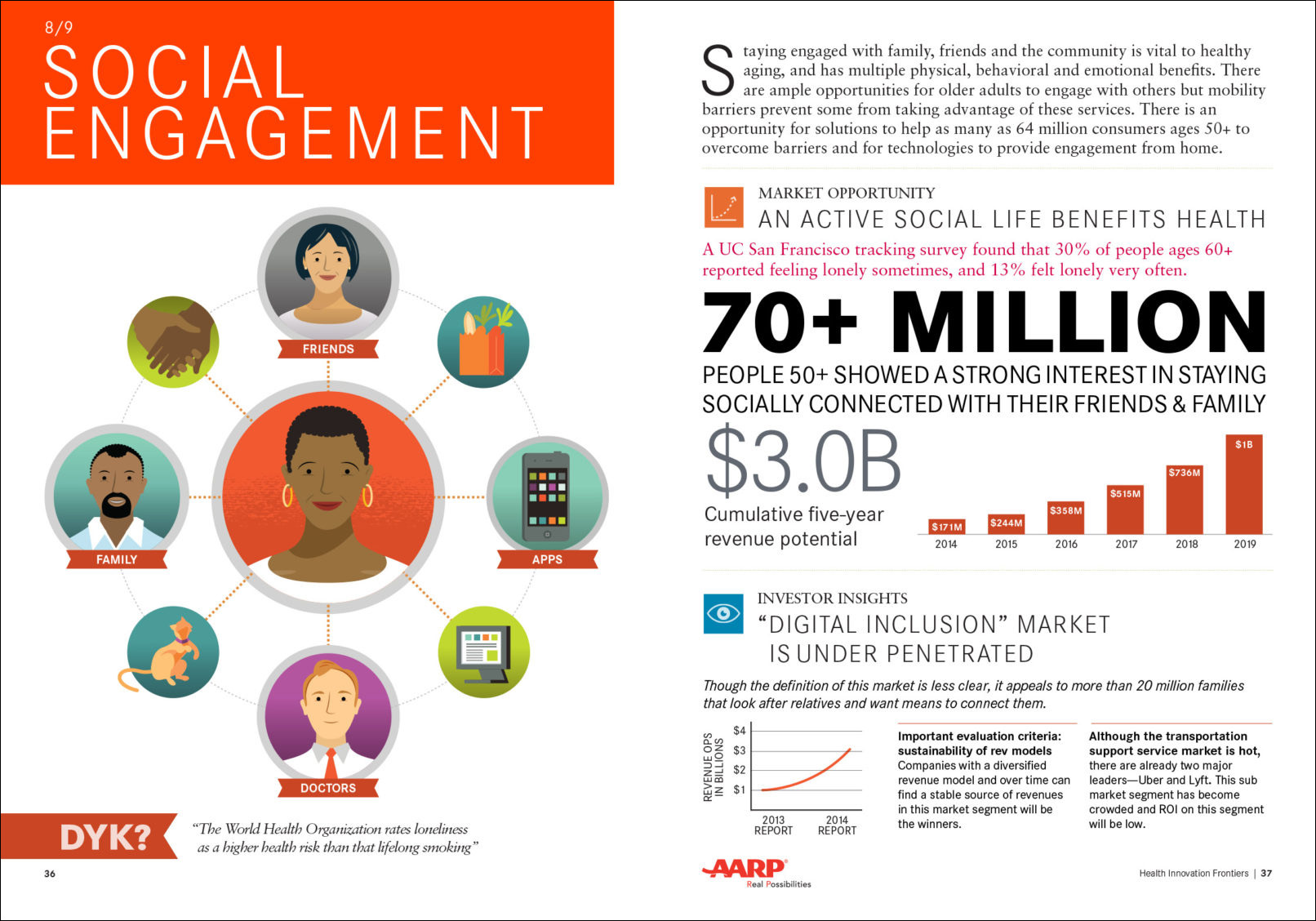
Health Innovation Frontiers report for AARP, part of a series of reports in which we created wide of a variety of data visualizations and illustrations.
When storytelling with data, using the right kind of chart is key. This excellent graphic will help you determine the best chart for your data: The Extreme Presentation Method Chart Chooser. It’s been around for a long time and is a very useful reference for common data visualization techniques. Some charts are better for comparisons. Some are designed to show composition. Some show relationships best while others help make clear distribution. This chart will tell you! Chart design is much more complicated than many people realize. And keep this in mind: 3D fanciness just complicates things more. Avoid it.
Slide-based report design for Adobe. More on this project here.
It is absolutely critical that you don’t skew the data and that you make sure your visualizations are accurate. One one hand, there are honest mistakes. On the other, so too are there purposeful lies. In between there is accidental deception. For example, zooming in on the scale can drastically skew the perception of data. Just look at the two charts below. They show the exact same data at different scales—but one is deceptive whether done on purpose or not.
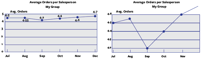
Graphic from How To Lie With Charts, Jones, G.E., BookSurge Publishing (2006). The chart at right exaggerates the data, misrepresenting it.
The one on the right—whether accidentally or purposely—really distorts the data. It makes the differences seem extreme when they’re not: “Wow— we had a huge drop on September!”. The chart on the left is a much more accurate representation of what’s really happening: average orders are staying pretty constant. The best data visualizations don’t take any chances when it comes to misrepresenting data.
Finally: visualize other parts of the story in engaging and unexpected ways
Add context | Why should the audience care? The data should follow a logical flow and each chart should help build the narrative you’re trying to achieve. The data can’t do this alone, which is why good writing and quality visualizations are what round out the best ‘storytelling with data’ projects. This is especially helpful when you’re trying to show correlation, or make sense of insights from outliers.
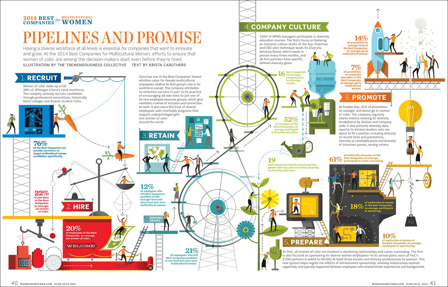
How to create a diverse workforce, designed for Working Mother magazine. Instead of filling the spread with overly-simplified charts, we turned the data into a flowing narrative—a much more creative visualization. Single percentage stats typically don’t make for good charts—better to visualize a concept around the number than to craft a superfluous chart.
Seen above, this infographic for Working Mother magazine is a self-contained piece of storytelling with data. Although it follows a somewhat fantastical Rube Goldberg-style journey, every bit of data is both clarified in text and visualized as an integral part of the whole. This could, of course, also be presented linearly in a PowerPoint, moving from one data point to the next through the cohesive narrative. It would also make for an incredible interactive data visualization.
Most charts are best left to be just that: charts. It’s generally not recommended to embellish complex data when it’s being presented in chart form. After all, the form of the chart itself is what gives meaning to the data. In the example above, there is a lot of data, but zero charts. We chose to bring the situations to life to help tell the story. In this case, the wide variety of standalone percentages did not necessarily benefit from being represented in charts. It was more important to engage the reader around the stats.
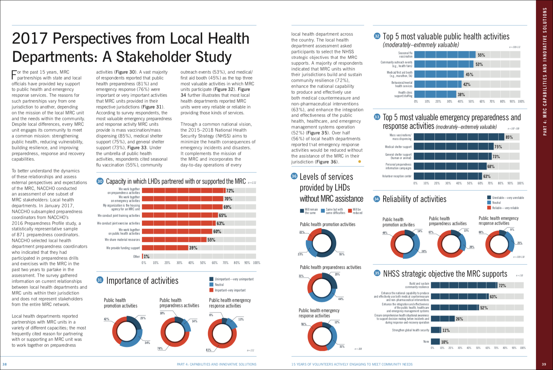
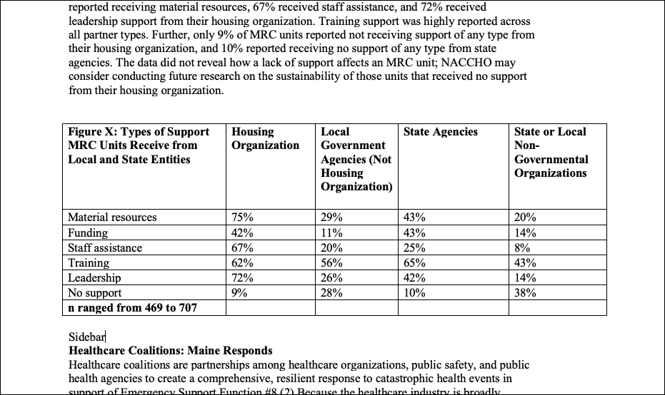
When comparison amongst lots of data is required, a clear chart is usually superior to compelling illustration. Spread from a NACCHO Medical Reserve Corps. report.
Call to action | What do you want your audience to do after getting this information? Now that you’ve made it easy for people to understand the data, Point out notable insights, or if there are areas which require more attention and research. Use builds in PowerPoint to show the data, then to highlight the most important part. Don’t make people work to understand your point.
Yeah, most data presentations aren’t going to be as exciting as a summer blockbuster movie—but that doesn’t mean they should be dull or anodyne. On a case-by-case basis you need to consider if the story you’ve got to tell requires more design oomph, or if PPT clip art and screenshots of Excel charts are “good enough”. There is almost always some kind of story buried in data—and it’s up to you (or us!) to dig it up and to make it both clear and engaging for your audience.