Visual storytelling transforms ordinary information into engaging data visualizations
What is data visualization?
No matter how cutting edge the term data visualization sounds to you, the idea is not so new.
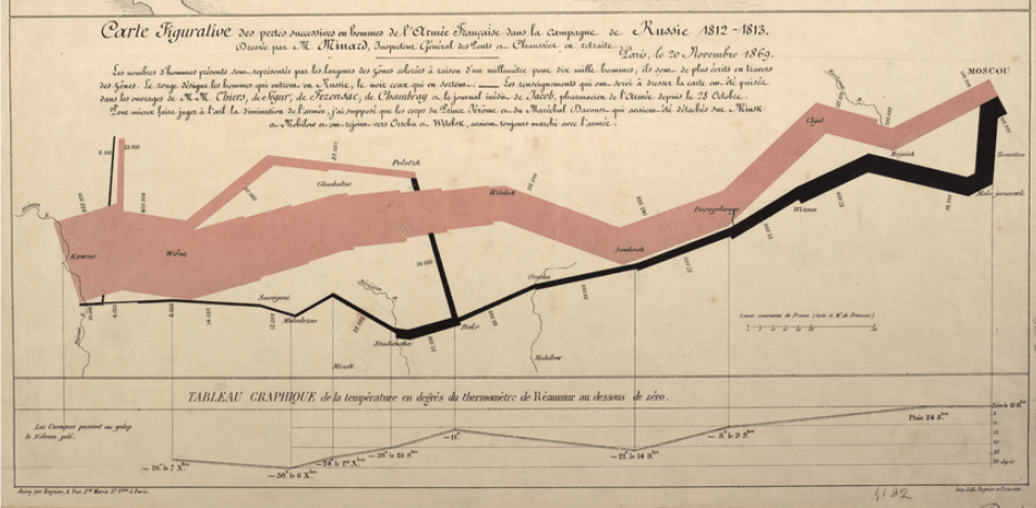
Charles Joseph Minard made clear the devastating mortality of Napoleon’s 1812 invasion of Russia way back in 1869. This is often cited as one of the very first examples of an infographic.
Fifteen years earlier, Dr. John Snow used dots on a map to show that the Broad Street cholera outbreak of 1854 was the result of contaminated water sources.
And well before these relatively modern examples, people were using forms of data visualization for scientific and communications purposes. The Turin Papyrus Map, dated to 1160 BCE, shows the distribution of sandstone resources used in statue-making, as well as information about how to extract it.
And while the locations of three stars are painted in the prehistoric caves of Lascaux, today’s scientists recently mapped the placement and brightness of more than 1.7 billion Milky Way stars—in 3D.
Data visualization. It’s art. It’s science. It’s data brought to life in charts, plots, and graphics using lines, dots, and illustrations.
And it’s integral to the modern business. Valuable, persuasive, meaningful data often is locked up in hard-to-read spreadsheets or databases. While these are key to managing the data, they aren’t the best way to express or showcase it.
This is the challenge you face: how can I make my complex data more accessible, understandable and usable for a variety of non-expert audiences? The solution is adding a layer of visual storytelling.
What are the benefits of using visual storytelling to make complex data understandable and engaging?
Often data visualizations are done programmatically. Software ingests complex data and visualizes it in ways that cover the gamut from “this looks like amazing abstract art” to “this looks like a bad PowerPoint chart”. We’re big fans of the stuff that leans toward abstract art, but we’re even bigger fans of creative visualizations that provide content, context, and a consideration of the viewer.
“The main goal of data visualization is to communicate information clearly and effectively through graphical means. It doesn’t mean that data visualization needs to look boring to be functional or extremely sophisticated to look beautiful. To convey ideas effectively, both aesthetic form and functionality need to go hand in hand, providing insights into a rather sparse and complex data set by communicating its key-aspects in a more intuitive way. Yet designers often fail to achieve a balance between form and function, creating gorgeous data visualizations which fail to serve their main purpose — to communicate information”.
—Vitaly Friedman, Smashing Magazine
Some data don’t need the creative aspect. The charts that help NASA decide if a rocket should launch or not, or the diagrams that teach medical students difficult procedures can and should be clear, efficient, and straightforward. Same with many Business Intelligence and data journalism projects, where accuracy and ethics make a more agnostic approach preferred.
But many organizations can benefit greatly by using creative visual storytelling to make complex data understandable and engaging. This is what Tremendousness does.
Animated data visualizations bring great stories to life by combining the power of visual thinking with the wonder of a compelling narrative. Music, sound, story, data, and art come together and demand attention—whether for 15 seconds or 15 minutes.
Interactive data visualizations let your audience dive into the information, guided by a story, or, at the very least, a simple narrative enabled by effective wayfinding. By empowering users to scroll, click, swipe, sort, and tap—you give them the ability to explore and engage with data in a personalized way.
That said, data can also come to life in static infographics, whether formatted to be printed and hung on a wall, viewed on a large screen, or on the powerful mobile device everyone carries around in their pockets. That’s the power of storytelling: good stories transcend the delivery mechanism. And in today’s fast, furious, multimedia world, you need all the leverage you can get in order to connect with your audience.
How can I use visual storytelling to make data visualization more engaging?
Data is information. But sometimes, in order to get from info to insight, it needs design help in the form of charts, graphs, and other visuals that showcase meaningful ideas, patterns, and correlations.
Data visualization is best used for:
-
Quantitative data—including comparisons, change over time, etc.
-
Understanding and showing causality or correlation
-
Data that shouldn’t be editorialized or distorted
-
Visualizing “Big Data”
Data visualizations are powerful: they can both break down data and highlight connections. Simultaneously, they can show the extent and depth of complex data as well as bubble up key findings in simple, powerful ways. Here are a few data visualization examples…
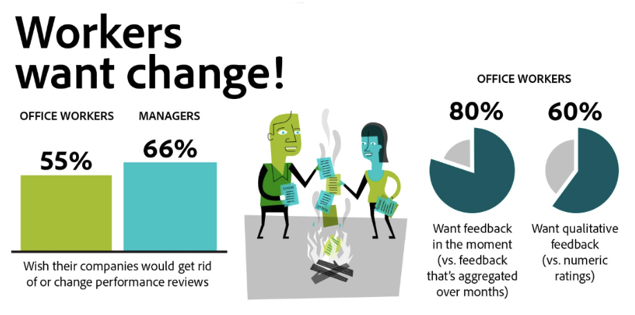
ADOBE: Adobe recently conducted research on the impact (or lack thereof) of performance reviews in the workplace. After surveying 1,500 office workers, Adobe found the seemingly helpful and common HR practice to be… a big fail. The survey produced some astounding results, and Adobe engaged us to help to turn their findings into a clear, compelling, visually pleasing one-pager highlighting the key findings in a fun and understandable way. Not only that, we designed an entire report featuring the most informative learnings and stats. Each piece is perfect for both internal and external use.
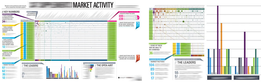
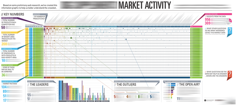
FORTUNE 500 CPG (CLIENT CONFIDENTIAL): A global consumer packaged goods leader faced a common problem: How to share vital market research with executives in a meaningful way. Should they enter a new product category? If so, how broadly? Should they acquire another company or invest internally to develop their own product line? Our client conducted extensive research to understand the category and wound up buried in an overwhelming amount of cumbersome spreadsheets and reports. Tremendousness brought clarity to the research through data visualization and information design—helping to surface insights and promote sound decisions. We transformed spreadsheet data into a set of custom designed, wall-sized data visualizations that teams can both stand back and study or interact with. The designs highlight the data and call out key insights, prompting teams to ask important questions and explore deeper.
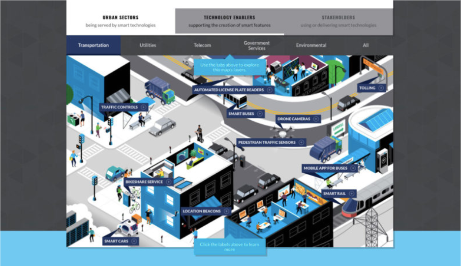
FUTURE OF PRIVACY FOUNDATION: Cities and communities generate data through a vast and growing network of connected technologies that allow services to function productively. These “smart cities” raise privacy issues, but sophisticated data privacy programs can mitigate these concerns while preserving the benefits of cities that are cleaner, faster, safer, more efficient, and more sustainable. The Future of Privacy Forum asked us to help them visualize a smart city and all the kinds of data in use.
Tremendousness can help
Based on those stars painted in Lascaux, France, you could say data visualization has a history dating back nearly 17,000 years. So the question right now is this—what are you waiting for?
Bring your data to life by contacting Tremendousness today. We’re a creative agency that uses information design to help businesses, nonprofits, and other organizations explain complex data, ideas, innovations, products, and processes.