Beyond words—why you should use visual storytelling for your next big idea
Lots of us—whether businesspeople, teachers, innovators, or even parents—rely heavily on our words to explain important, complex things.
It’s our default, and it’s pretty easy. Most of us are perfectly happy with that. Talk, write, read. Read, talk, write. We’re satisfied with this because, yes, it’s pretty easy, but it’s also pretty effective. None of us here at Tremendousness are going to argue that verbal and written communication is bad.
What we will argue is this: words alone aren’t enough.
We believe quite strongly that the best teaching and learning often begins with, “Let me show you.”
Our experiences prove that the best problem solving usually starts with, “Let’s take a look.”
And everyone knows that we say, “we’ll see” when something (however abstract or invisible) is yet to be resolved… and when we do, in fact, understand something, we say, “I see”.
Even when visuals are not part of the equation, our brains lean heavily toward visually-oriented phrases and idioms. Like nearly all quirks of language, the root origins of these phrases give them their meaning.
We say “let’s take a look” because collaborative exploration leads to understanding.
We say “let me show you” because demonstration is an effective teaching tool.
We say “I see” because our own visual confirmation gives us the greatest confidence that things are, in fact, the way we expected them to be.
The near-magical power of visual storytelling is that it helps make things real and concrete. The combination of pictures and words removes the ambiguity of language. It increases understanding because it can manifest ideas as symbolic things (see our Gratitude project, which visualizes concepts such as feelings), and can represent real things as abstractions (see our Gateway Arch project—which shows the parts of a whole that are not always visible, as well as historical context that is not always apparent).
Words often are open to interpretation, but pictures give everyone the same view and the same platform from which to base their understanding. For more, check out Drew Crowley’s post about live sketching as well as W. Scott Matthews’ write-up about the origins of our name and logo.
So now let’s look at three ways—including befores and afters—that you can go beyond words and use visual storytelling for your next big idea.
1. Go beyond bullet points
If you work in any kind of office you probably have been either the victim of Death by PowerPoint, or have caused Death by PowerPoint. PPT decks are unavoidable, but they don’t have to be unengaging. Whether you work in corporate, academia, government, or the startup world, presentations are the go-to communication tool. The issue isn’t the format, it’s the form of the content.
Typically this means dense blocks of copy, endless bulleted lists, bad charts, cheesy stock photos, and low quality clip art. I’m not trying to be mean or elitist; it’s just the truth. It doesn’t matter whether you’re explaining a life-saving pharmaceutical breakthrough, discussing diversity and inclusion, or pitching next year’s mobile gaming phenomenon—almost all decks are more noise than story. They’re noise not because the content itself necessarily is bad but because the presentation of that content is simply undifferentiated, unspecial, unable to elevate the most important signals.
Let’s take a look at the before and after for a deck we worked on with Edelman and Adobe. The goal was to create meaningful visuals, easy-to-understand graphics, and a people-focused, chapter-based, grid-reliant design that helped frame and tell the story.

2. Amplify your articles
Editorial professionals already know that visuals help tell stories. Media, especially magazines and web sites, gets it. Editors and art directors appreciate that visuals don’t just draw people in—they also can help people work things out. Infographics help increase understanding and retention, as well as lead to action.
We’ve worked with lots of editorial outlets to help create visual stories for their readers. Sometimes we help capture the essence of a long article in an illustrative spread, sometimes we incorporate an entire shorter article into a visual page. In this example, we turned a piece about workforce diversity into an easy-to-understand infographic centerspread for Working Mother magazine. The visual summarized key findings so readers could understand the main points quickly, then dive into the details later as they browsed the full package of features.

3. Enrich research papers
Again, the point is not that long, detailed papers are bad or unnecessary—far from it! It’s more that many readers or potential readers simply want and need to understand the big picture first, without reading 50 or 100 pages. Long word-based explanations require significant time investment for readers, whether it’s a smart yet dense academic research paper or a powerful but long corporate white paper.
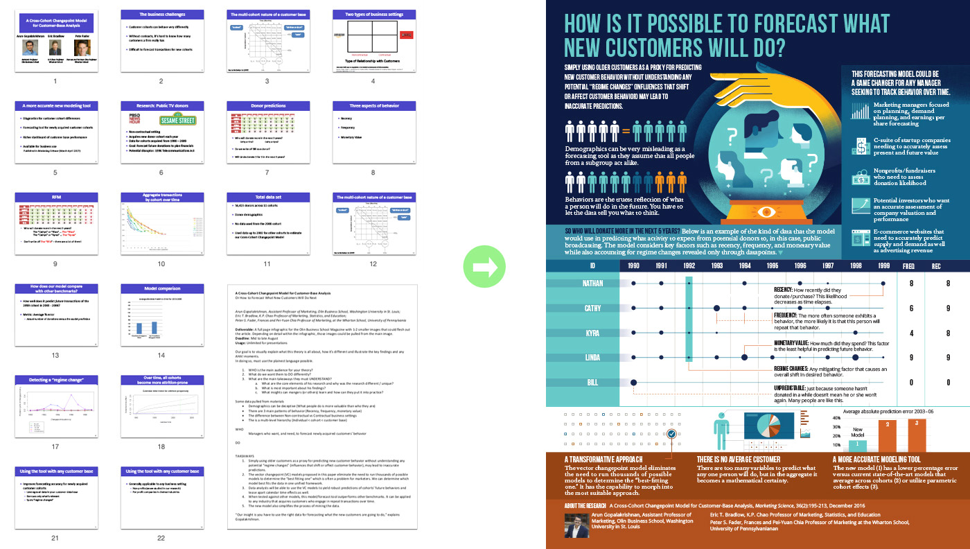
Here, for Washington University in St. Louis, we transformed a research paper entitled “A Cross-Cohort Changepoint Model for Customer-Base Analysis” and its accompanying slide summary into a one page overview understandable by the general public.

To truly get the ROI you want out of the time and money you’ve already invested in 1) gathering and analyzing the information for your presentation; 2) assigning, editing, and/or writing your article; or 3) researching and producing your white paper or research paper, you should summarize the whole thing in a visual story.
Infographics, illustrations, animations, and data visualizations move your message beyond the status quo, enabling people to quickly understand not just what’s special about your next big idea—but what’s in it for them.
Illustration by Maddy Mueller / Tremendousness
