The story behind our name
The thing I most enjoy about our company name is what happens when it’s said out loud during client introductions, especially to a new audience who hasn’t heard of us before.
“We are joined today by some of the folks from Tremendousness.”
The name usually elicits smiles or funny looks—and a few times I’ve seen people pause for a moment, then say, almost jealously, “That is one of my favorite company names ever.”
It’s also fun checking into hotels when the person at the desk asks for the company name.
“Tre-mend-ous-NESS? I like that.”
I’m glad people respond well to it. I like it a lot—but I didn’t at first. Let me explain.
Back in 2012, when we were just starting out as a fledgling design firm, we knew we needed a name that reflected a vibe of creativity, intelligence, and storytelling. Something short and snappy, memorable, infodesign-y. Something with an available domain name. It was slow going…
Elaborate, Grasp, Factor…
After weeks of discussion and list-making, my partner Bill said, “What about The Tremendousness Collective?”
I can’t speak for others but my immediate reaction was “What? No.” I didn’t like it at all. It was too long and said nothing about information design. Apparently it was inspired by a song he wrote a long time ago. So the brainstorming continued.
Briefcase, Rectangle, Massive Brevity…
Weeks went by. Nothing was jumping out. The good names were all taken. Then, one day we reopened the Google Doc to look over the options once again.
Paceline, The Clear Theory, The Tremendousness Collective…
Hmmm. Suddenly its appeal came shining through. It was a total exaggeration of who we were: a small information design firm of five people. At the same time it also gave us room to grow—a lot of room. It was a way of being boastful, but with a sense of humor. It also had a note of, “You get what you pay for!” Most importantly, it spoke to the idea of wrapping our heads around subjects that seem vast and hard to comprehend, and doing great things. Hey, that does sound like an information design firm!
Bad news: the domain www.tremendousness.com was taken. Good news: www.tremendo.us was available—though it would cost us several hundred dollars in an auction.
That was money well spent. OK, we were ready to roll. Now we needed a logo.
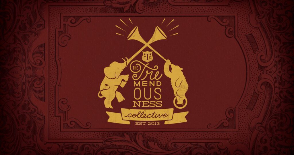
It seemed only natural that since we had an over-the-top name we needed an over-the-top logo—something like one might see on the shield of a Masonic lodge or some other mysterious organization.
After doing some research and having more conversations, we decided our logo needed animals. We wanted ones that had stories to tell, like us! Maybe a wise owl or a sly fox. What about a wolf or a lion? So many options.
Long story short, we settled on a bear and an elephant. We chose them because they’re animals with rich backstories in global culture, and they appear in fables that we found very appropriate. We chose them because these animals are associated with stories about collaboration and communication.
The bear and the two travelers
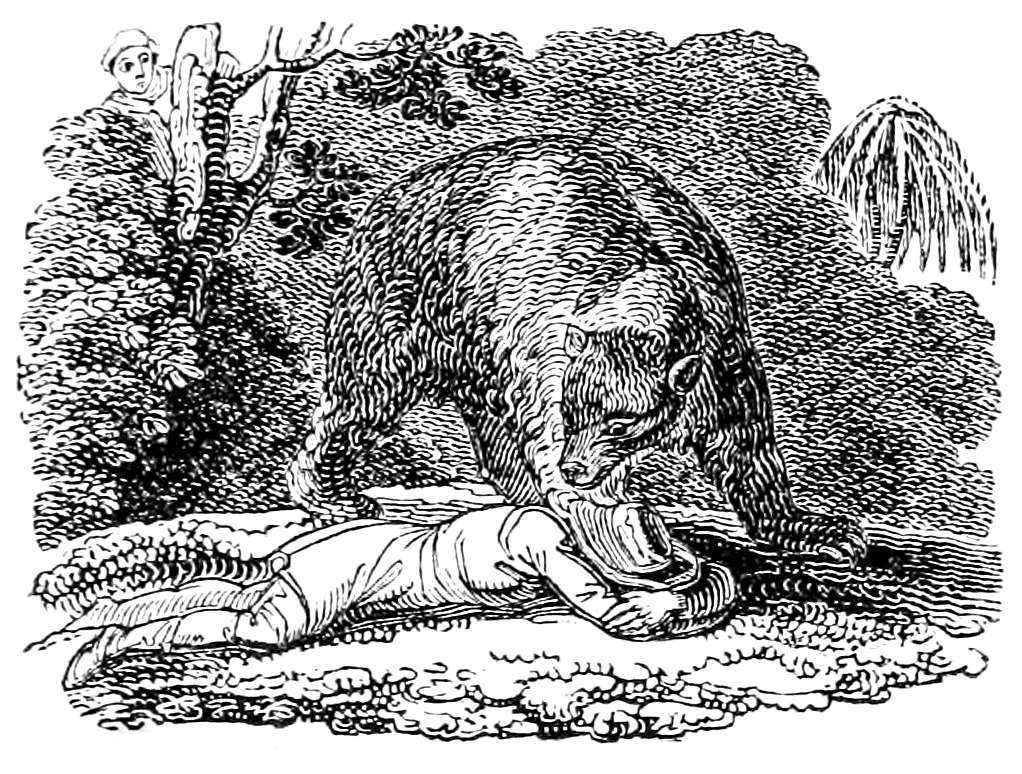 The above image is attributed to C. Whittingham, 1814.
Two friends were walking through the forest when they were suddenly confronted by a bear. The first traveler saved himself by pushing aside his friend and scrambling up a tree, leaving the other to drop to the ground and play dead.
The bear lumbered over to the traveler on the ground and seemed to sniff around their ear, snorting, and ultimately walking away after a few minutes.
Once the bear was safely gone, the first traveler climbed down from the tree and jokingly asked what the bear had whispered in his friend’s ear. “He had some good advice,” the second traveler responded. “The bear said never keep company with someone who deserts you at the first sign of danger.”
Aside from the fact that neither of these actions are very good initial bear defense techniques (especially for grizzlies), it still seemed to be a fitting fable for five people about to embark on the difficult journey of building a new design firm.
The blind men and the elephant
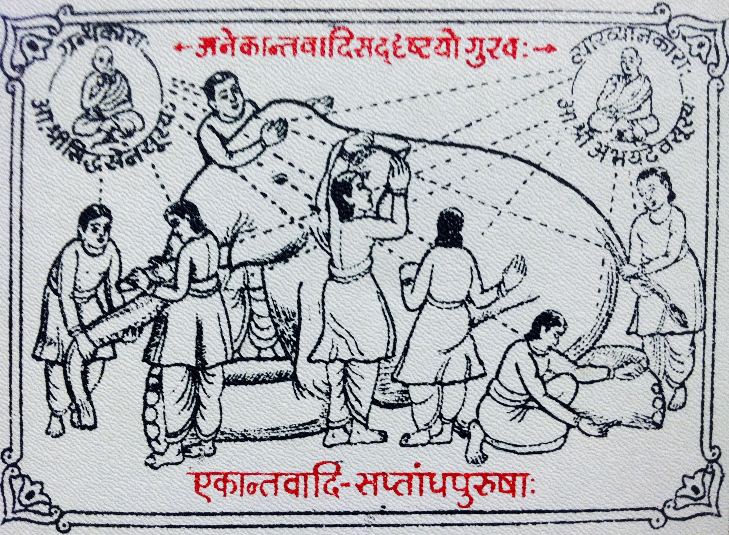
Blind monks examining an elephant, an ukiyo-e print by Hanabusa Itchō (1652–1724).
A group of blind men heard that a strange animal called an elephant had been brought to their town, but none of them were aware of its shape and form. Out of curiosity, they said: “We must inspect and know it by touch.” It was brought over to them they all felt different parts of it.
The first man touched the trunk and said, “This being is like a thick snake”. The second touched its ear, and thought it seemed like a kind of fan. The third touched its leg and said the elephant seems to be “like a tree.” The fourth put his hand upon its side said the elephant, “is like a wall”. The fifth man, who felt its tail, described it as a rope. The last man felt its tusk and thought the elephant seemed hard, smooth and like a spear.
Each of them only understood a part of the whole. None had a true understanding of the elephant.
We thought this was also a good fable for our new design firm, as we specialize in helping our clients and their customers share information and broaden their viewpoints in order to understand the bigger picture and accomplish their goals.
The journey continues
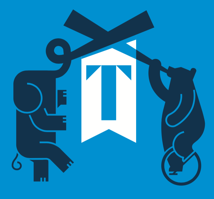 So that’s the story of the stories behind our elephant and bear logo. We’ve been at it for seven years now and while we’ve had a few ups and downs, the five of us have stuck together, added some very talented people to the collective, and are still enjoying new client reactions to our name.
We don’t use the bear and elephant in all our branded materials, but we’re still Tremendousness (or “The Tremendo’s” to some) and the meaning behind that logo still comes through in everything we do.