When confusion = clarity
There’s a design that’s been making the blog rounds the last couple weeks. Its origin is nearly 20 years old but it’s never been more relevant. At first glance the poster appears ridiculously simple, nearly “undesigned”… then after a second or two it becomes bewilderingly complex. It’s confusing, and that’s what makes it such a successful design.
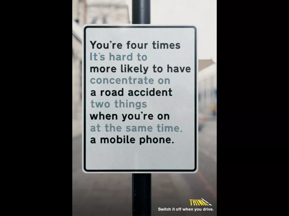
One font. Two colors. Twenty-seven words. Zero visuals… all to try to prevent the ~1.6 million crashes that happen every year because someone used their phone while driving (one out of every four car accidents in the United States is caused by texting and driving*).
The design is so successful because its very construction proves its point. There’s an initial confusion; you’ve got to work to comprehend the message. On its own this is a pretty captivating hook. Then, when you realize your brain is trying to multitask—to do/read two different things at once—you regain control and switch to monotasking. Then the hook becomes solving the riddle.
We can think of visual storytelling in much the same way: the actual arrangement and flow of words and visuals embody and deliver specific messages. Form adds a layer of meaningful explanation. Well-made infographics visualize and summarize important messages quickly, without the purposeful confusion this poster is meant to trigger (unless we’re talking about a comparison visual showing current state vs future state, us vs them, bad vs good, old vs new, etc., then the contrast shows how things could go from confusing to clear).
Visual narratives also help to force monotasking. Like this poster, they require a little bit of effort to dive into, but after a quick level-set they guide viewers along a compelling storyline. They break complexity down into simple chunks to explain a process, product, change, or even an idea that isn’t yet “real”. They show and they tell. Seeing is believing.
And that’s what this poster does (it is not an actual road sign!). Sure, it does it in a very different way than our visual stories do—but the design IS the meaning. Confusion = clarity. Content = context. Existence = evidence. Once you get it, you’re really hooked. You read it again and despite how serious the topic is, there’s some fun in having solved the puzzle. That kind of engagement works to deliver the sender’s message and prompt the receiver’s “light bulb” moment: you can’t do two things at once. And when you take a few seconds to go through the lines, to focus on and follow the intended story, to do what you should be doing, you get it.
You really get it.
Image: poster by AMV BBDO & THINK!
*Source: National Safety Council