Visual storytelling makes research real
Your research is only as good as the visual story it tells
Research is so coooooooool. Did you see the recently released, first-ever photo of a black hole?
Research is booorrrrrring. Have you read “The nature of navel fluff”, a paper on the causes of belly button lint?
Whether awesomely enlightening or dreadfully dull, complex research topics are difficult to summarize. The papers usually are quite long, written for an expert audience, with language that often is insider and obtuse—even when the findings are critical to many peoples’ lives in so many ways.
Research—whether academic or business-focused—could have a big impact on an organization’s efficiency or bottom line, an employee’s satisfaction or productivity, or a student’s education or earning potential. It might help save lives, protect the environment, bring history to life, or invent the future. When you think about it, everything revolves around research in one form or another.
This means it’s critical to ensure that valuable research is shared in a way that allows people to engage and understand. Visual storytelling helps make complex data, detailed research methodologies, and important results meaningful to larger audiences. Unless you’re a researcher yourself, would you rather read this…
Not everyone is going to want to read a dense research paper (and not every needs to!). But to increase an interest in and understanding of the findings, the trick is to simplify and summarize key concepts without dumbing them down.
…or would you rather read this?
We turn award-winning research from Washington University’s Olin School of Business into simple visual stories that make sense to alumni, media, and other interested audiences.
The result is only as good as the process
Getting from long paper to lucid picture is no easy task. And just as the right methodology is crucial to the integrity of your research, the right creative process is fundamental to transforming it into an effective and successful visual story.
Regardless of the client or audience, we typically follow our core creative process for most projects. You can read about it in more detail at that link, but it in general it’s not unlike many studios’ processes: Discovery -> Concept -> Blueprint -> Production.
However, it is unique in a couple important ways. First, the entire process is intensely collaborative—clients are deeply involved at every phase and our team of consultants, artists, journalists, and others brings both intelligence and creativity to the project.
Second, the quality of our deliverables is simply miles beyond most infographic shops and creative agencies. We don’t just slap a big number next to a little icon twenty times and call it an infographic. We create true visual stories—cohesive, comprehensive narratives that tell your story in an engaging, effective way.
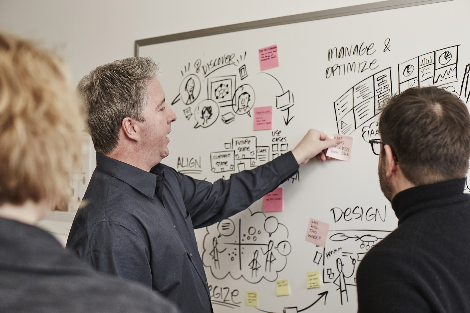
A collaborative and highly visual process helps transform the “Ug!” of dense data into an “A-ha!” of understanding.
Here’s a sampling of some of the work we’ve done for businesses, non-profits, academia, individuals, and others to bring important information out of the “lab” and into the world. In some cases, we can’t show the full project. But there are links to learn more about the ones we can share.
Visual research findings for business, technology, and innovation
 |
 |
 |
|
AARP AARP and Park Research compiled a goldmine of data about the untapped $30 billion health and wellness market for the 50+ population—but busy entrepreneurs and investors don’t have time for 200-page reports. So Tremendousness clarified the opportunities in a highly visual publication filled with meaningful visuals and key insights. |
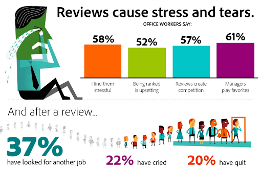
Adobe Adobe works with Golin to do research on communications, creativity, office work, and other topics integral to how we live, work, and play. This report, one of several we’ve done with Adobe, focuses on performance reviews. “The findings from this survey show how time consuming, cumbersome and demotivating performance reviews are for many employees,” said Donna Morris, executive vice president of Customer & Employee Experience at Adobe. |
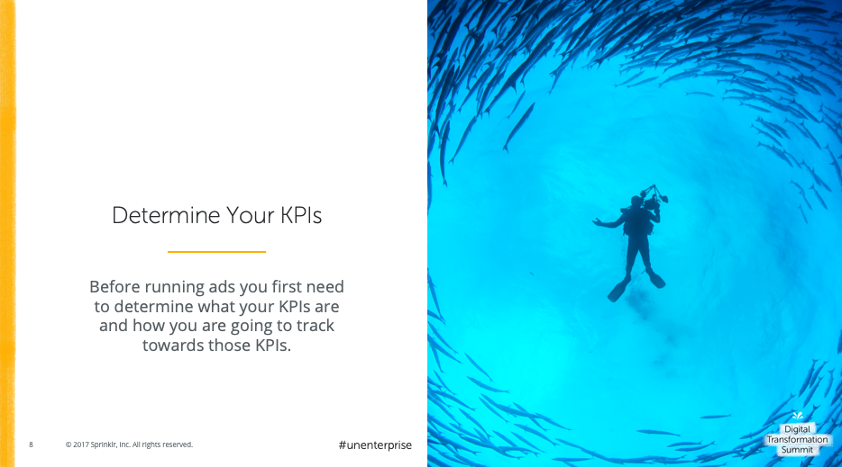
Sprinklr Social business titan Sprinklr runs several conferences. For a recent Digital Transformation Summit it brought together thought leaders and experts from the world of social business for several days of sharing and learning. Tremendousness produced all the speaker decks, helping make complex ideas clear to the thousands of attendees. |
Make health, nutrition, and wellness research understandable to key audiences
 |
 |
 |
|
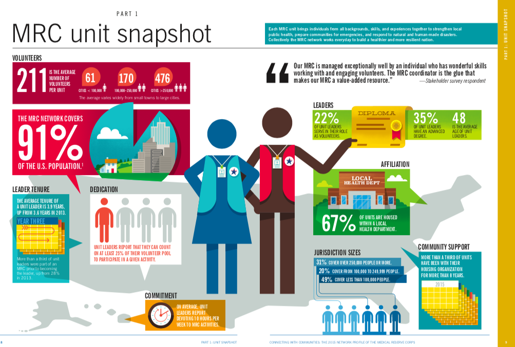
NACCHO We’ve designed several reports, infographics, and data visualizations for NACCHO, and the 2017 Network Profile of the Medical Reserve Corps report presents the newest data on unit funding, partnerships, composition, activities, and capabilities. We also created a web site featuring dynamic, interactive data viz components. |
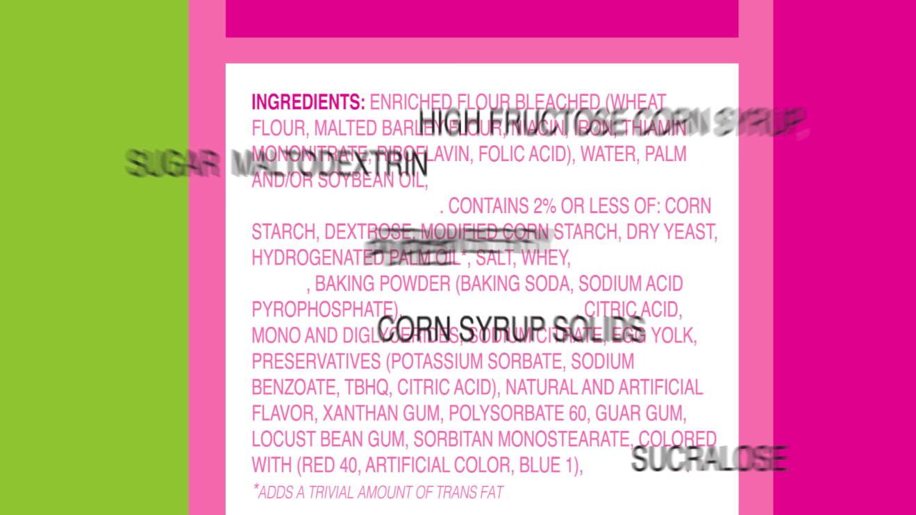
TEDEd Dr. Robert Lustig is on a mission to educate people about the health dangers of added sugars. In this video he decodes confusing labels and IDs sugar’s many aliases to help us determine just how much of that sweet carbohydrate makes its way into our diets. We know candy, soft drinks, and ice cream are full of sugar, but it also hides out in foods you might not expect—including peanut butter, pasta sauce and even bologna. |
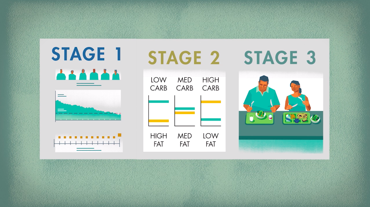
NuSI Visual stories aren’t just for research results. We’ve also created them to explain the purpose behind new studies just getting underway, like the Nutrition Science Institute’s Framingham State Food Study. Although this study is now completed, the video was created to help people understand both the approach and the importance of this nutrition research. |
Turn education and learning research into clear, engaging visual stories
 |
 |
 |
|
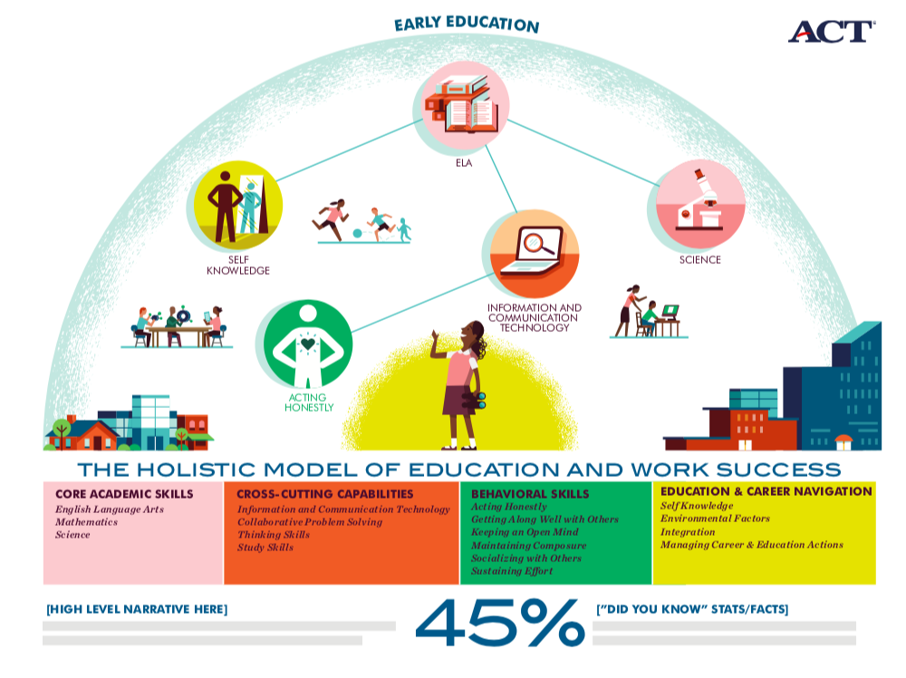
ACT ACT is a mission-driven nonprofit organization and its insights unlock potential and create solutions for K-12 education, college, and career readiness. We worked with its leaders to design a presentation that captured the four domains of the organization’s holistic framework—a visual depiction of kindergarten through career that highlights interconnections and outcomes. |
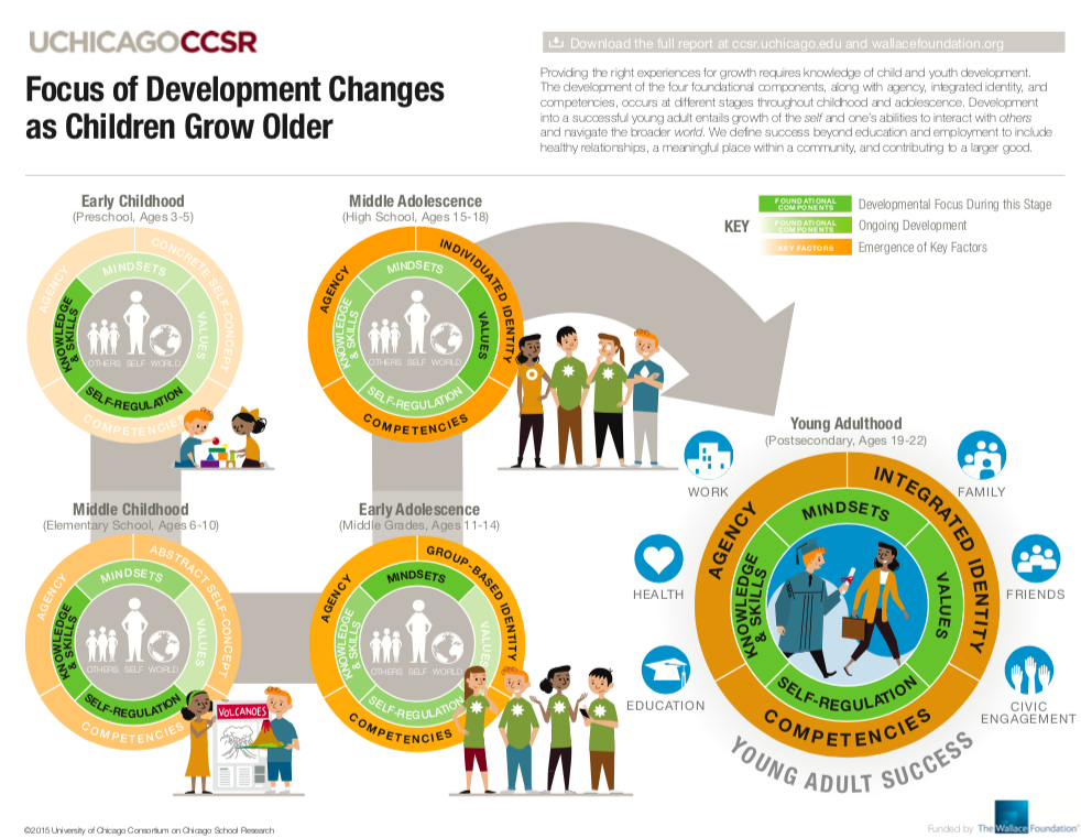
Wallace Foundation Tremendousness collaborated with Wallace Foundation and the University of Chicago to create an infographic to increase understanding of a new framework for the development of traits that contribute to young adult success. The audience focused on educators, researchers, youth development leaders and practitioners, and policymakers. |
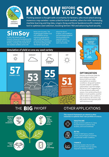
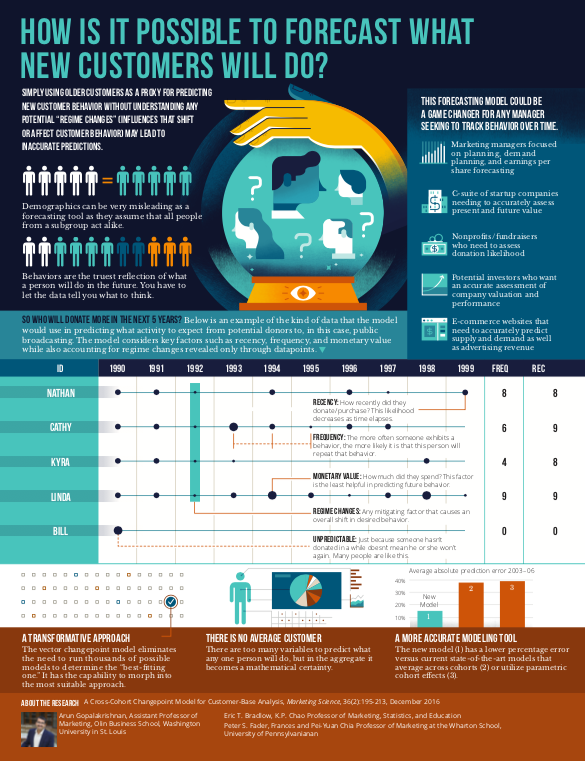
Washington University Washington University’s Olin Business School has been a leader and innovator in business education for more than a century. Tremendousness helped the school’s researchers explain how it’s possible to forecast new customer behavior by understanding potential “regime changes” (influences that shift or affect that behavior). |
Visual storytelling makes research accessible
All of these “pretty pictures” do much more than fancy up complicated research. They make it accessible to a broader range of audiences, influencers, stakeholders, and supporters. To be able to transform dozens of pages of words into a one-page overview, a short animated explanation video, or a clear and engaging report gives researchers and organizations a powerful advantage.
When you make your research accessible with visual storytelling, you make it more available, more effective, and more real to the world.