Verbal to visual: Podcast sketching
By Maddy Mueller (alum)
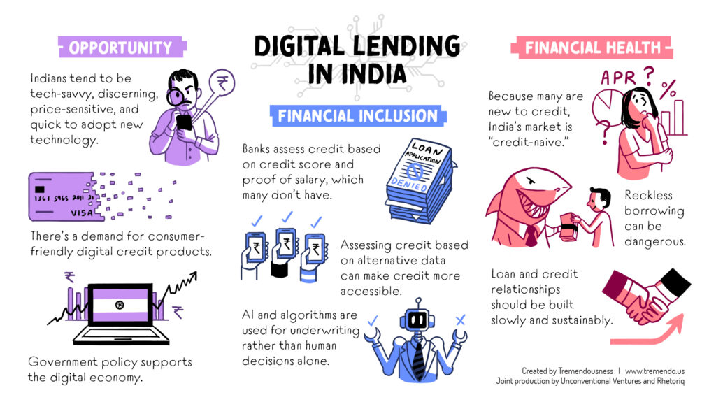
Since the beginning of the year, we’ve been creating a regular series of sketches to support Rhetoriq, a podcast about technology and innovation. These drawings typically accompany a series of episodes called “Red Envelope,” published under the Rhetoriq umbrella. “Red Envelope” focuses on fintech (that’s “financial technology” for the layman out there) and innovation in Asia.
This assignment is a bit unique among our client work because it’s an ongoing series about one broad topic, and therefore presents a set of interesting challenges. First, the layouts need to look unified across the series—but not so similar that they become boringly repetitive. Similarly, the drawings themselves often revolve around repeated themes from week to week, and generating fresh concepts can be a demanding task. After months of experience, those of us who work on Rhetoriq have honed our processes to overcome these challenges. Here’s mine.
1. Listen, take notes, and research
Step one, of course, is to listen to the week’s podcast episode! I take detailed notes as I listen; I usually write down everything I hear without discretion, because you never know what can contribute to a good drawing. Then, after listening to the entire episode, I spend some time researching the content I just heard about. I’m not a fintech expert by any means, so this step is usually fairly in-depth and time consuming. (After having created Rhetoriq sketches for a while, I’ve learned a lot—ask me about blockchain and open banking, digital banking licenses, Indian demonetization, and the background of Asian tech companies such as Alibaba and WeChat!) I find that in order to make a compelling and accurate editorial drawing, it’s important to have a robust understanding of its subject, so the research is worth the time.
2. Distill
After taking notes and making sure I’ve digested and understood them, I narrow them down to a small number of points to highlight. This is a process of intuition; it involves asking, “What were the most important parts of the episode? What were the most interesting? What would make a good visual?” The most common format we use for our Rhetoriq pieces are a collection of nine captions and editorial sketches divided into three categories of three. While the episodes themselves aren’t explicitly divided into three categories, I usually find that the groups naturally emerge over the course of the episode. Occasionally the episode doesn’t seem to conceptually fit this format and would work better as, say, a single image, or a hub and spoke layout. Again, I follow my intuition when deciding what ideas to highlight and how to present them. As long as the overall style is maintained, layout variations aren’t a problem. In fact, they almost certainly add interest as the series builds over time. But I’m getting ahead of myself—at this point, the ideas still exist only as words, not as visuals.
3. Concept
Now for the meaty part! Concept sketching is the most pivotal step of the process: it’s where the drawings happen. When I can, I sketch on a whiteboard, where I have plenty of room and can quickly erase anything I don’t like. I always try to imbue the drawings with as much charm as possible. If I have the time to devote, I’ll try to make 2-3 sketches per concept. Getting all of my ideas out quickly without self-censoring is helpful, and the more I draw, the closer I get to something I can use. Sketching can be challenging; in some ways, thinking of concepts has become harder over time, because the subjects discussed in the podcast are similar from week to week. (It can be easy to fall into a rut of drawing lifeless phones, currency, and banks.) There are several solutions to this problem: abstracting more or less, varying previous metaphors, doing more research, and sometimes just consulting a second pair of eyes in the office can all lead to new ideas.
4. Narrow and refine
At this point, I always get feedback on my sketches from a creative director or senior colleague. There’s often a clear winner among every batch of sketches, but sometimes combining ideas is the way to go, and occasionally it’s necessary to create a new drawing altogether if a sketch I thought was clear turns out not to be. That’s why it’s so important to get a lot of eyes on your work! After narrowing down to one sketch per concept, I arrange the drawings with type in a visually clear and dynamic layout according to the intuition and general system I discussed earlier. When it’s finished, we send the sketch to our client, Theodora Lau, and she sends feedback. Typically, all that’s left to do at that point is to polish and complete!
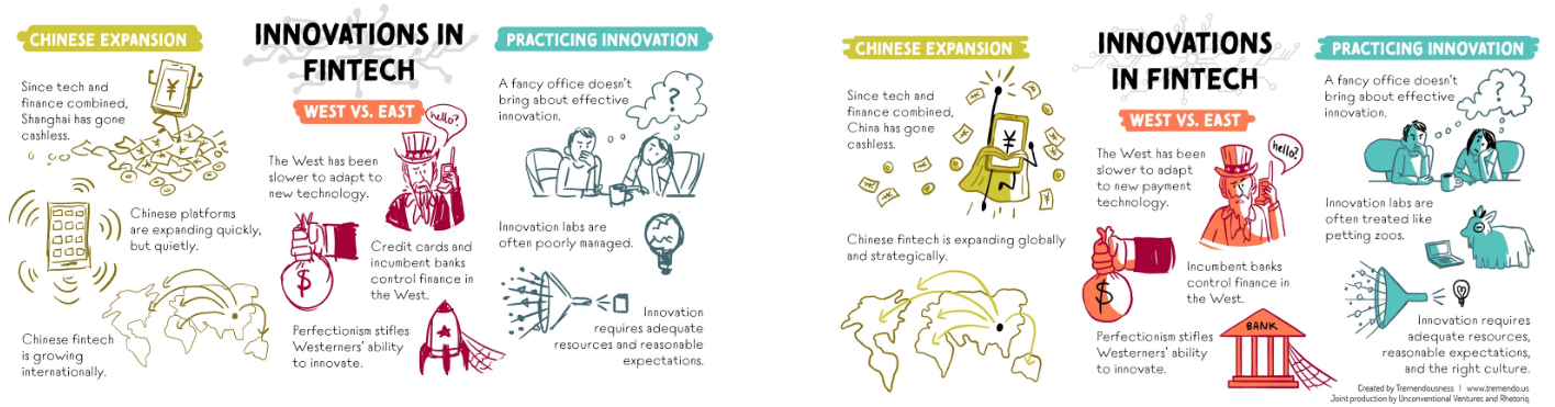
At left is my napkin sketch, which is pretty tight because the layout often is consistent from podcast to podcast. At right is the final illustrated piece. You can see that as we iterated we combined two items in the left column into one, and changed the visuals for a couple items in the other two columns.
If you’re interested in seeing more on this topic or brushing up on fintech and innovation, check out Theo’s blog to find our work in the wild, and be sure to listen to the Rhetoriq podcast.
Images: infographics by Tremendousness.