Use color value to improve your illustrations
By Maddy Mueller (alum)
Here’s a quick trick to improve your use of color in illustrations.
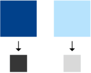 First you need to know about “value”—the relative lightness or darkness of a color. Every color has a value, and we can see a color’s value more easily by converting the color to grayscale. For example, in the image at right the blue on the left has a darker value than the blue on the right.
Learning value is the first and arguably the most important step in learning how to use color. Now for the trick I promised: convert your illustration to grayscale to test how well your values are working. Your image should read as well in black and white as it does in color.
 After testing for basic legibility, the next step is using value to strengthen your illustrations. For example, value can be used to direct the eye to a focal point. The point of highest value contrast in an image tends to draw the eye the most. This means putting a very light color against a very dark color or vice versa. You can do a “value thumbnail” of your image—blocking out the overall shapes in grayscale, preferably using only a few values—before adding color to quickly make sure you’re using value to push your composition and achieve the fastest possible graphic read.
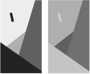
Compare the images at right. The shapes in the images are identical, and both images use only four values, but which composition’s focal point reads more quickly?
And the advantages to using proper values don’t stop at the focal point. Value can suggest vastly different lighting situations, spatial distances, moods, and more. It can also be used to push less important things back in an illustration. For example, adding light reflections on the windows of an illustrated office building makes it look more realistic, but you don’t want that kind of not-so-important detail to distract the viewer. In this case you’d dial back the value contrast.

Ultimately, if we know how to wield value effectively, it almost doesn’t matter what colors we use in an image. The colors can get as abstract or weird as we choose, and the image will still read well! So check it out in grayscale first, to make sure your color values are helping rather than hurting a viewer’s perception of the illustration.
Above: background art from The Mr. Peabody and Sherman Show, courtesy DreamWorks Animation. Value helps flesh out the landscape in the background, and enhances rather than distracts from the primary visual.
Learning value is the first step in learning how to effectively use color. If you can master value, you’ll be well on your way to mastering color!
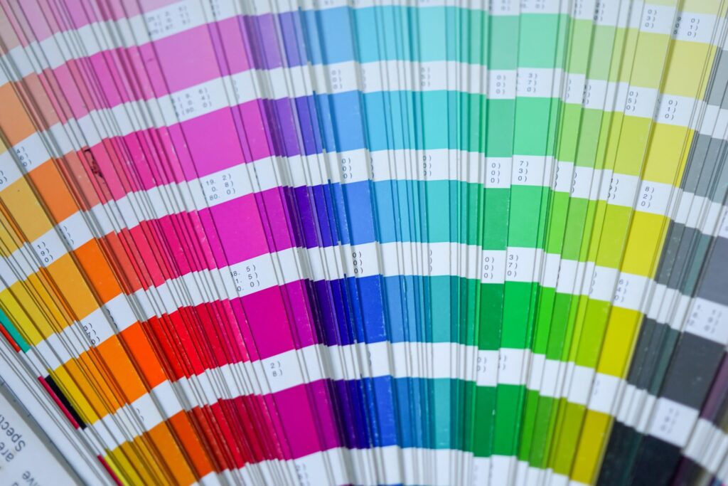
Image: Photo by Mourizal Zativa on Unsplash.