


There are no perfect election results visualizations
Visualizing election results isn’t just a design challenge — it’s a communication challenge. It requires strategy, storytelling, and structure to transform complex, often contentious data into something people can see, understand, and trust.
At Tremendousness, we think a lot about how information like this gets interpreted — and misinterpreted — especially when the stakes are high. This post explores the good, the bad, and the misleading in election maps, showing why no single visualization tells the full story and why clarity, context, and human-centered design matter more than ever.
The clarity we help create can be applied to so many things, even the endlessly messy world of politics.
For those of us who remember the 2000 U.S. presidential election, it was first time we experienced seeing a candidate win the popular vote but lose the electoral vote.
This was because it hadn’t happened since 1888.
It’s actually happened five times in this country’s history. In 2000, George W. Bush’s razor thin margin of victory over Al Gore in Florida (537 votes out of the nearly 6 million cast on election night) triggered mandatory recounts. But just over a month later the Supreme Court put a stop to those recounts, leaving Bush on top and the truth buried. In 2016 Michigan, Pennsylvania, and Wisconsin were urged to do recounts, but for various reasons none finished.
There were an abundance of controversies in both of those elections. In 2000 we had ballot design issues, hanging chads, and voter suppression. In 2016 we had foreign interference, disinformation, and voter suppression. And 2020?
Ug.
But one issue that elections everywhere have in common is how to represent election returns: simple vote tallies, colored maps, pie and bar charts, and other more innovative data visualizations all try to show who’s ahead in the polls, then who’s winning and losing on Election Day, then who won and lost.
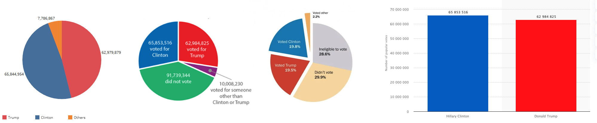
So let’s take a look. We’ll use 2016’s results in order to talk about (essentially) the same data across different visualizations. It was a very close race with 25.6% of America voting for Hillary Clinton, 25.5% voting for Donald Trump, and 1.7% voting for Gary Johnson. The remaining 46.9% did not vote, so we’re left using the numbers of those who did (these numbers come from the maker of the first maps below, and are not significantly different across all maps).
The numbers…
| Candidate: Percentage of votes: Popular vote: Electoral vote: | Hillary Clinton48.2% 65,853,514 227 | Donald Trump46.1% 62,984,828 304 | Gary Johnson3.28% 4,489,341 0 |
Keep in mind when looking at these visualizations that the effective difference between the candidates was 3 million votes out of nearly 129 million, or 2.3%.
The state & county maps
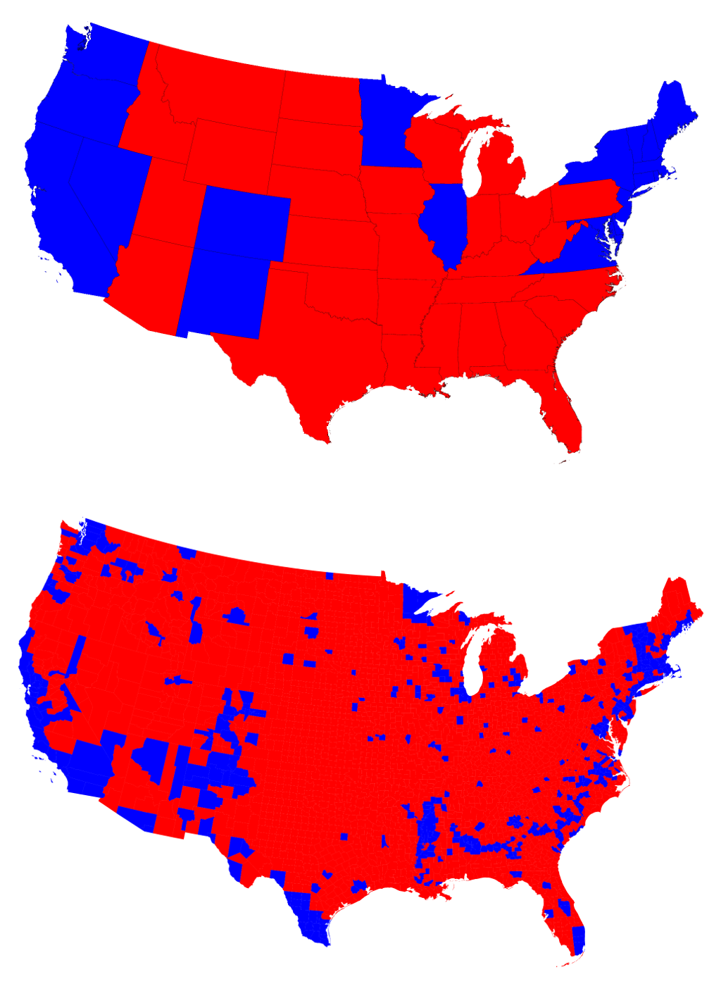 In the U.S. the most popular visualization is accurate in one way but problematic in others. Because our electoral college is made up of electors from each state, it’s easy to just color states blue (Democrat) or red (Republican) depending on whom those electors will vote for. But a map like this does not take into account population distribution or the actual preferences of those who voted. Do the maps at the right show a difference of about 2%?
And while this post isn’t about problems with the electoral college, you ought to read this passage from The Guardian anyway:
“The least populous states like North and South Dakota and the smaller states of New England are overrepresented [in the electoral college] because of the required minimum of three electoral votes. Meanwhile, the states with the most people—California, Texas and Florida—are underrepresented in the electoral college.
Wyoming has one electoral college vote for every 193,000 people, compared with California’s rate of one electoral vote per 718,000 people. This means that each electoral vote in California represents over three times as many people as one in Wyoming. These disparities are repeated across the country.”
Read this from The New York Times, as well. The point is that we see so many state maps like these because of the function of the electoral college. Take Montana. It’s a big state, geography-wise, but its entire population is less than one million people (the U.S. is home to more than 330 million). Hillary Clinton won the popular vote in 2016 by a margin of almost exactly three Montanas. Now, there are 10 cities in the U.S. with larger populations than Montana but the electoral college doesn’t distribute its votes in a way that matches up with populations.

Ultimately, national 2016 election maps like The New York Times’, shown above, appear pretty dang red despite being home to more people who voted blue. They do not show the votes of a very close race, they show the all-or-nothing electoral result. Land area doesn’t equal representation, but because electoral votes do we end up seeing these maps all the time despite the fact that they lack context and detail.
The cartogram
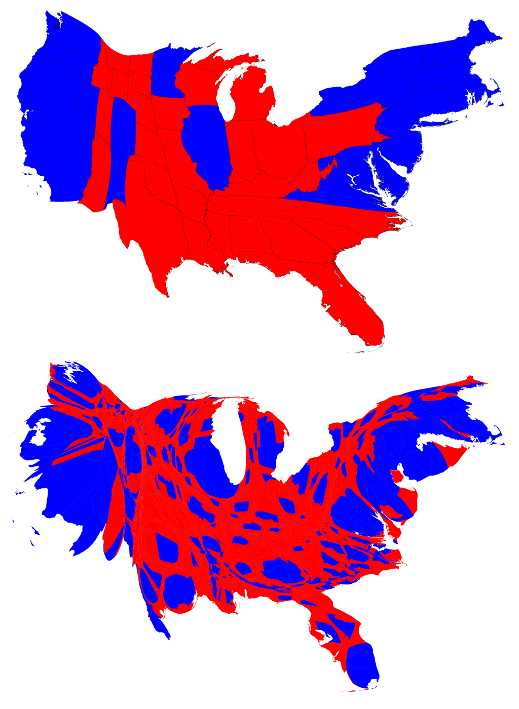 There have been many explorations for how to better show how America votes, but none are as comfortable and familiar as those with recognizable state or county borders, each appearing to be exclusively Republican/conservative or Democrat/liberal.
One solution is to create a cartogram that distorts the those familiar state boundaries into more representative shapes based on being proportional to the actual numbers of electoral votes won by each candidate. A cartogram is a map that shows statistical information in a diagrammatic form, commonly using that data to manipulate land area.
I’m not sure about you, but what we gain in accuracy gets lost in awkwardness. You almost feel like the world is off kilter looking a familiar map in a distorted perspective.
Even maps that use tints of colors to help show whether a particular county went strongly for one candidate (blue), the other (red), or was nearly evenly split (shades of purples) get visually complicated when the race is close. America, although not unique in its division into dozens of states with thousands of counties, is complex in many ways.
Below is how FiveThirtyEight reimagined the U.S. map to better represent electoral votes. Again, despite the meaningful data it’s just not an easy read for regular folks.

The 3D towers
In the map below the “height of each tower is proportional to the ‘voter density’ so that the volume of each ‘tower’ is proportional to the number of votes”. You get a much better idea for how high population urban areas compare to more rural parts of the country.
But… it’s ink-dense, it’s label-deficient, it obstructs its own data, and therefore it gives few “at-a-glance” insights into meaningful results.
3D charts, especially when displayed on 2D surfaces, create problems for perception. Unlike the meaningful skewing based on actual data in the cartograms above, the skewing happening here is just a result of 3D modeling itself. Can you really compare the votes in Oregon versus those in Ohio? No. Do you trust that the ~1/2-inch towers up front in Texas aren’t actually taller that the ~1/2-inch towers way back in Washington? I don’t.

The pie charts
Pie charts get a lot of shit, deservedly so. Truthfully, my favorite way to use them is with just one data point, turning them into more of a circular bar chart that acts as a graphical element, and whose power is in emphasis rather than comparison.
And that’s part of the problem. Typical pie charts look like graphics/art while bar charts—almost always the better way to display multiple categories—look like a math textbook. Despite their popularity, our brains process pie charts slower, and sometimes practically not at all when there are too many slices.
Below we see a few ways people presented the results in pie charts, getting more detailed as we go right. At far right is a bar chart with a barely perceptible difference. Even so, the results are more explicit and easily seen that any of the pie charts. But… since the popular vote doesn’t determine the presidency that clarity is practically moot.
Other solutions
There are many alternatives but none have quite stuck yet. Below is another of FiveThirtyEight’s pre-election visualizations, the “Snake Chart”. Here’s their description: “A candidate needs at least 270 electoral votes to clinch the White House. Here’s where the race stands, with the states ordered by the projected margin between the candidates — Clinton’s strongest states are farthest left, Trump’s farthest right — and sized by the number of electoral votes they will award.”

Then we have the aftermath of the election, presented in what I’ll call a “Sway Chart” from NYT. Their description: “Red arrows show how much Donald J. Trump surpassed Mitt Romney in counties across the United States. His most significant support came from counties in the industrial Midwest where whites without a college education are the majority.” This one is fascinating. Even without numbers it makes clear the huge shift that helped Trump win.

This post is in no way comprehensive and there are many other approaches, some of which you can see here.
A (non-)conclusion
But where does all this leave us? Because the electoral college is the actual mechanism by which our president is elected, you can argue that a bright red, white, and blue U.S map conveys the technical results in stark black and white. Much is lost in that simplification, though, because a red map doesn’t make for a red country. In fact, the common map doesn’t just color the peoples’ choices in a way that misrepresents what happened, it also colors peoples’ perceptions of what is.
I think those red and blue state maps lack context and don’t represent the votes we make today as much as they represent an election system written into the Constitution back in the 18th century. Even worse, though not the fault of the makers of today’s maps, they represent a system based on a time and a democracy different from ours, a system changed only minimally as this country grew in all kinds of ways, and a system that was never a literal representation of the will of the people. (For an interesting look at the history and semantics behind “Democracy” and “Republic” and how that relates to our electoral college, see this recent post on Vox: Sen. Mike Lee’s tweets against “democracy,” explained and NYT’s ‘We’re not a democracy,’ says Mike Lee, a Republican senator. That’s a good thing, he adds.)
Ultimately, I really like the visualization by Karim Douïeb below—it helps to embody the idea that “land doesn’t vote, people do” by removing the red and blue geographic saturation (left) we’ve become used to and replacing it with proportional colored dots sized to the population of each county (right). Within each blue dot, of course, are red voters and vice versa, but it really helps to show how the sparsely populated the huge swaths of red are in the US. It’s just a better representation of what is (how the country votes) even though it doesn’t tell you what happened (who the country elected).

Each of the maps and visualizations above add context to the results in different ways but none are able to accurately represent all the relevant details. In the end think that just showing the electoral and popular vote numbers in a comparison is the clearest way to present the information—but that’s not even a visualization! Vote results are like scores in sports. The numbers show you who won but they don’t tell the story of the game.
Regardless, no matter how weird they get I’m always interested in seeing new and better ways to visualize both the votes and the results of our currently endangered democratic process. Bonus points for somehow including the other half of the country—the half that can’t or don’t vote—because they’re a factor as well.
So please vote!
State & cartogram maps by Mark Newman, University of Michigan. State and electoral count map by The New York Times. Cell map by FiveThirtyEight. 3D tower map by Robert J. Vanderbei, Princeton University. Pie charts by Syntagium/CNN, SmartHive/Elect Project, and Washington Post/Scatterplot. Bar chart by Statista. Snake chart by FiveThirtyEight. Sway chart by NYT. Dot map by Karim Douïeb.
