The Tremendous 10 link roundup, #217
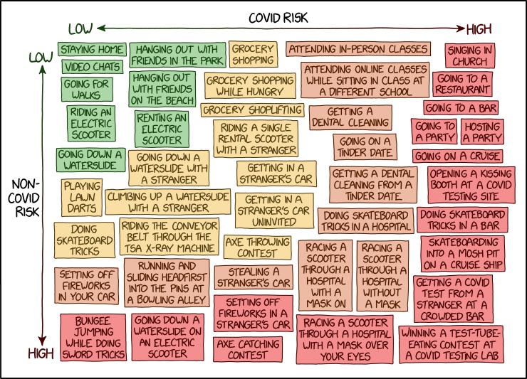
- xkcd COVID Risk Chart. Related: Charts rank COVID-19 risk involved in more than 60 activities.
- Andrew Cuomo is touting a new pandemic poster. Artists call it an ‘incoherent’ mess.
- How to Create Brand Colors for Data Visualization Style Guidelines | “Your brand colors don’t work for data visualization.”
- Looom | “A new way to create hand-drawn animation. So playful you’ll think it’s a toy, but it’s secretly a robust app with a reimagined UI for animators and creators.”
- BUSINESS EROTICA | “DUMB BOOKS YOUR BOSS LIKES.”
- Room Rater | “We rate Skype rooms and Zoom rooms, too.”
- The psychology behind to-do lists and how they can make you feel less anxious | “As the days blend together for many people living in lockdown, crossing things off a to-do list can feel even more satisfying. To-do lists can be great tools for decreasing anxiety, providing structure and giving us a record of everything we’ve accomplished in a day.”
- This Woman Inspired One of the First Hit Video Games by Mapping the World’s Longest Cave | “Patricia Crowther’s ex-husband coded her cave maps into one of the first hit adventure games in the 1970s, and she had no idea.”
- Stranger Than Fiction History Behind Roman Ring | “This fun and educational Twitter thread from @OptimoPrincip takes a look at the mysterious history behind an enigmatic Roman ring. As it turns out this ring very well could have inspired J.R.R. Tolkien’s own ideas behind the infamous Lord of the Rings trilogy.”
- Is this advertising’s best ever optical illusion? | “You can practically hear Sonos’s logo.”
Image: visual by xkcd, link #1.