The Tremendous 10 link roundup, #199
- Defining your own career path | “Because the answer to any of the career questions we face is inevitably ‘it depends’ we are then led to ask ourselves what our personal, individual answer would, in-fact, depend on. And in my experience there is really only one dependency to keep in mind when it comes to the work you do and how you do it: who is you want to be?”
- A high school student redrew a map of the US | “Some people just want to watch the world burn. But only a mad few decide to light the blaze themselves. Enter Anna Calcaterra, the 16-year-old daughter of NBC Sports reporter Craig Calcaterra and, apparently, an aspiring cartographer. We know that because Calcaterra found a map his daughter made on her desk on Wednesday afternoon and tweeted it — taking Twitter by storm.”
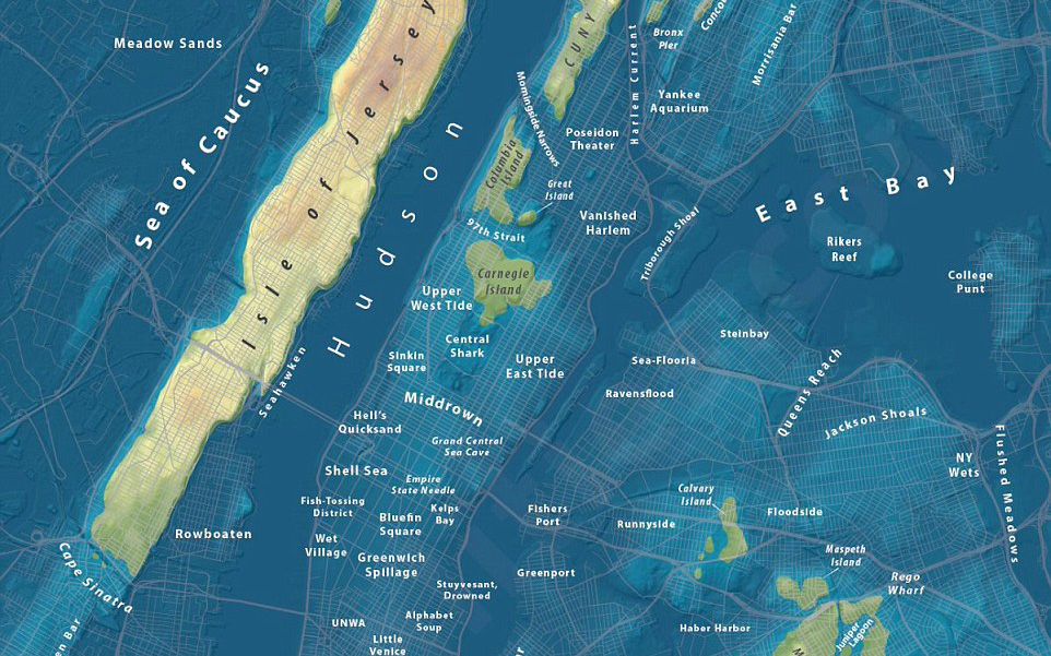
- Maps show what major U.S. cities would look like if world’s glaciers melted | “The N.Y. Sea, Vancouver Archipelago and London Bay don’t exist — but they could be place names in future atlases as glaciers continue to melt. A Seattle-based urban planner has created maps of cities around the world showing the alarming results of what the world would look like submerged in water.”
- How Hollywood relies on TEN types of movie posters | “Film buff reveals the categories from the ‘leaning couple’ of rom-coms to ‘black and orange’ for action.”
- Here’s Why Slate Operators Matter (And Why Quentin Tarantino’s is So Great) | “Over at Polygon, Ben Kuchera suggests that Quentin Tarantino’s secret weapon could be his camera operator. Perhaps that’s overstating things a bit, but the extent of influence a slate operator can have is more significant than you may realize.”
- How to reduce digital distractions: advice from medieval monks | “Medieval monks had a terrible time concentrating. And concentration was their lifelong work! Their tech was obviously different from ours. But their anxiety about distraction was not.” Via Kottke. ort of related: I Trained Myself to Be Less Busy — and it Dramatically Improved My Life.
- USA Today Network Branding | “When USA Today was looking to create a cohesive visual language among the over 50 local news brands in their network, they tapped DKNG to develop a system of iconic badges that would reflect the individuality of each newspaper, while at the same time working within a consistent style that would make the entire network recognizable and ownable.”
- Fox redesigns its NFL graphics for the point-your-phone-at-the-TV era | “As Kansas City Chiefs kick returner (and buffet line troublemaker) Mecole Hardman carried the opening kickoff out of the end zone, Fox unveiled its new look. It happened without an excess of ceremony, unlike everything else that day. A tight formation of parallelograms unfurled at the bottom of the screen. The words “49ERS” and “CHIEFS” glided into view and faded away, replaced by logos of the respective teams—logos so large that no parallelogram can contain them, but these parallelograms try their best nevertheless.”
- Data-Driven Decisions Start with These 4 Questions | “The truth is that to get useful answers from data, we can’t just take it at face value. We need to learn how to ask thoughtful questions. In particular, we need to know how it was sourced, what models were used to analyze it, and what was left out.”
- What is information design (these days)? | “The term ‘information design’ sounds academic, but it’s really egalitarian. Its entire purpose is to explain something so people can take informed action. And like, say, air, it’s something everyone needs yet rarely thinks about until it’s desperately needed.”
Image: map by Jeffrey Linn, via link #3.