The Tremendous 10 link roundup, #189
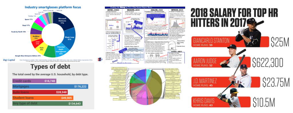
- WTF Visualizations | “Visualizations that make no sense.” Yep.
- What a difference a word can make: How a single word can change your conversation | “British psychologist Elizabeth Stokoe studies the patterns in talk that most of us don’t even notice. She explains how her research can be used to train people to interact more effectively.”
- BETTER LETTERER: Comic Lettering Tips | “These infographics were originally posted on Nate Piekos’s social media accounts, and are collected here for your reference!”
- Eyes on the Text, Mind on the Type | “This page compares typographic styles from different eras. View the differences in letterforms and the slight adjustments required in setting for type styles originating from the 16th, 19th, and 21st centuries.”
- TV, or not TV: The story of our bike box | “It was a simple idea. But it exploded. In 2015 we began shipping our bikes to the USA. The only problem was that a lot of them were arriving to their new customers damaged. Annoying for them and expensive for us. We couldn’t say for certain, but US handlers didn’t seem to take as much care as we’d hoped.”
- Four Favorite Tools: Fantastic tools selected by 150 notable creators | New book from Kevin Kelly: “Creative people tend to accrue a nifty set of tools. Great tools enable efficiency and further creativity, and sometimes inspire whole new ways of working. For the past five years, we have interviewed notable creators in a 25-minute podcast for Cool Tools, asking them to rave about four of their favorite tools. These tools range from classic handtools, to state-of-the-art laser cutters, to perfect pencils. Each pick is a surprise and a lesson. The 150 best past responses from the Cool Tools podcast are presented in this book. The result is 300 pages of concentrated goodness and tool fandom.”
- The lost 25-minute short film that originally debuted in front of ‘Star Wars: Episode V’ is finally available to watch | “Directed by ‘Empire’ art director Roger Christian, ‘Black Angel’ is a stunning short film set in medieval times that follows a knight who battles a ghost-like warrior for the soul of a young girl.”
- Why Sci-Fi Is Bad for Design | “Tech that looks cool in the movies is often distracting and frustrating for real users.”
- Designing a product backward | “A long time ago— like 15 years ago— I worked at Sun Microsystems. The company was nearly dead at the time (it died a couple years later) because they didn’t make anything that anyone wanted to buy anymore. So they had a lot of strange ideas about how they’d make their comeback.”
- The Role of the Artist in the Age of Trump | “And the power of stories that are unshakably true.”
Bonus STL design link: After ‘soft launch,’ Cardinals’ new-look STL logo gets a cleaner, sharper makeover | “It started with the plan for a decorative oversized logo outside Busch Stadium, one that could be a meeting place like Stan Musial’s statue, a focal point for broadcast reports of activity around the ballpark, or just a favorite fixture for fan selfies — that interlocking STL rising up right over their shoulder. That was when the Cardinals noticed the needlepoint at the top of the logo’s ‘S’.”
Image: charts via WTF Visualizations, link #1.
