


Infographics help make health & wellness content accessible
Infographics are one of the most powerful ways to communicate complex ideas. They are especially valuable in the healthcare sector where clarity and accuracy can be a matter of life and death. Let’s look at how these visual tools help teach, communicate, and (sometimes) even overcome language barriers.
Why use infographics in healthcare?

Healthcare is one of our sweet spots here at Tremendousness. In addition to the education and technology sectors, health and wellness clients top our list of repeat customers. The work we do ranges from global brand projects with leading healthcare consulting firm Avalere to targeted community initiatives with organizations like the Center for Vulnerable Populations at UCSF.
After all, what’s more important than our health? The healthcare industry is both life-saving and economically important. So it follows that nearly any health-related message that needs to be communicated must be clear. It must be correct. It must be concise (unless for some reason it needs to be highly detailed instead). Healthcare messaging simply must be effective, and visual storytelling through infographics and animated explanations is a proven way to boost both attention and retention.
Dropping science
Even if you’re not selling a health or wellness product, you’re probably selling an idea, an approach, a change, or a process related to health and education. Marketing isn’t just for consumers, though that’s how we usually experience it. The science behind marketing is incredibly useful in other contexts as well.
Nearly 40% of people respond more positively to visual information as opposed to plain text. Health infographics help bring to life topics that may otherwise be seen as dull or unimportant. In fact, according to a 3M study, our brains process visuals 60,000 times faster than text—and 90% of information transmitted to the brain is visual.
It makes sense that marketing is highly visual. And it makes sense that learning should be more visual. So it must of course make sense that healthcare marketing and learning should be highly visual. Even if the efficacy isn’t a compelling enough reason, the value ought to be: infographics can cost 62% less than traditional marketing (and can generate three times as many leads).
Infographics also make compelling and easily shareable content, receiving three times more likes and shares than other content types. They also can boost SEO by standing out to curatorial resources and search engines aiming to share interesting and relevant content.
Types of health infographics
The types of infographics we create for the health sector align with the types we create for everyone. Unfortunately, a great deal of the work we do is for internal audiences and cannot be shared. But let’s go over the basics because it helps to understand how different kinds of infographics help to answer different questions.
Most health infographics—whether medical infographics or healthcare marketing or mental health infographics, or visuals that explain kombucha or Alzheimer’s or gratitude or the dangers of added sugars—fall into one of three visual frameworks.
- System infographics: Show components and how the elements of an ecosystem connect
- Process infographics: Illustrate key sequential steps in activity or construction
- Comparison infographics: Illuminate differences between things like products, ideas, competitors
Static infographics
Here’s an example of each (click to see the full version)…
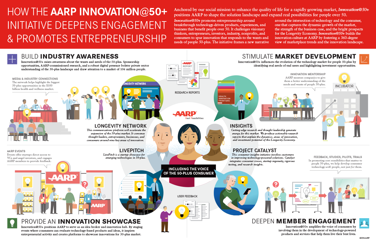 | 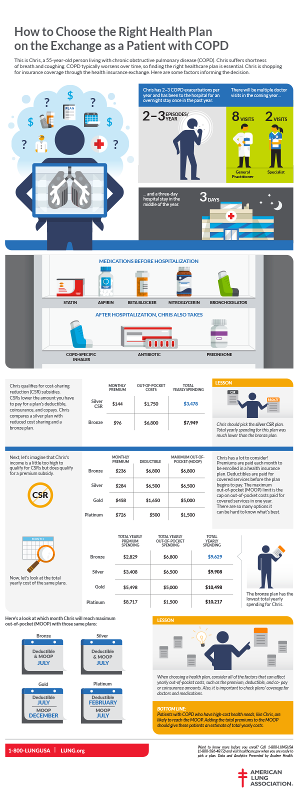 | 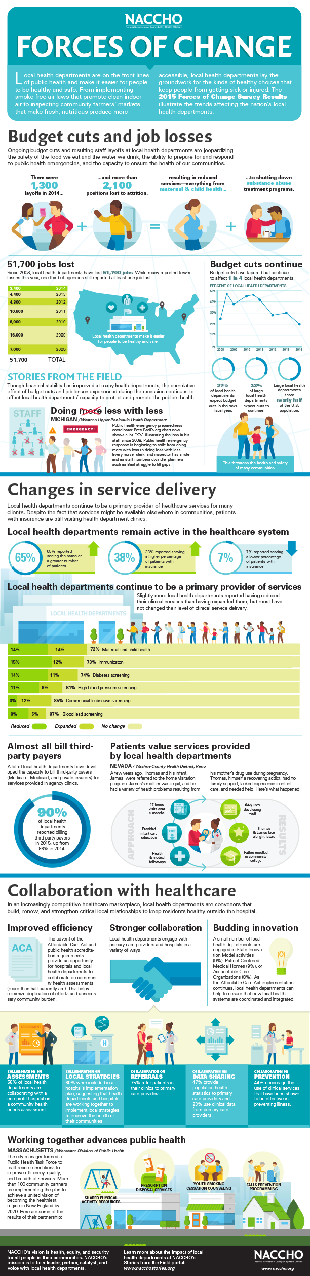 |
SYSTEMAARP Innovation @50+ infographic: This project shows the parts that make up a whole, and the benefit of it all coming together. It’s good to note that health infographics are not always about a specific medical condition or procedure. It’s a huge industry requiring administration, technology, and innovation—just like nearly every other business. Much has to happen behind the scenes. | PROCESSAvalere & the American Lung Association COPD infographic: Typically, process infographics are very map-like, guiding the viewer on a journey or making clear the sequential steps one must take to accomplish a certain task. Here, we showed a man with chronic obstructive pulmonary disease shopping for insurance coverage. While not map-like at all, the infographic covers his situation and options with pictures, words and data, making a complicated, stressful process more real and concrete, step-by-step. | COMPARISONNACCHO “Forces of Change” infographic: Many comparison infographics visually highlight concepts like “old way vs new way”, “us vs them”, or “before and after”. But data-oriented infographics are also considered to utilize the comparison framework, with charts that show change over time or help to explain how funding is divvied up or used. |
Animated infographics
Animated videos also are a powerful format for communicating about wellness and the importance of health education. Often these tell a story using a combination of frameworks, mixing process scenes with comparison or ecosystem visuals wherever it makes the most sense. The style can be a very important part of the story as well, with either straightforward or more “cartoony” visuals sometimes more appropriate to a particular topic.
Here are three motion examples. Click the image to view…
 | 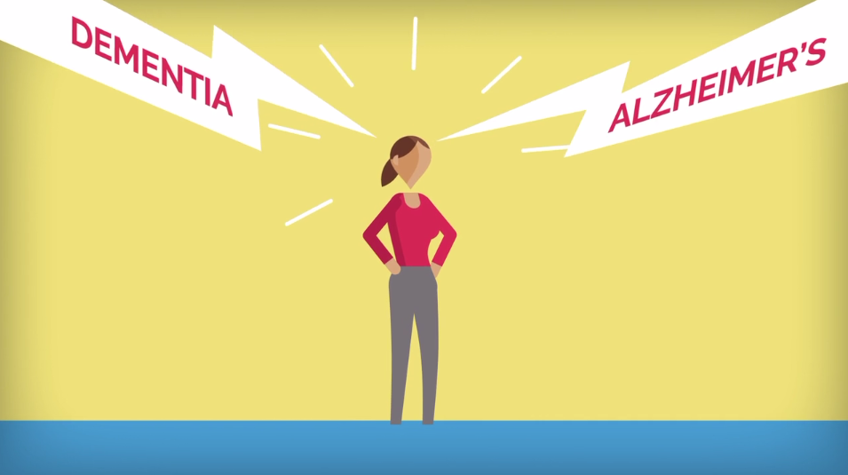 | 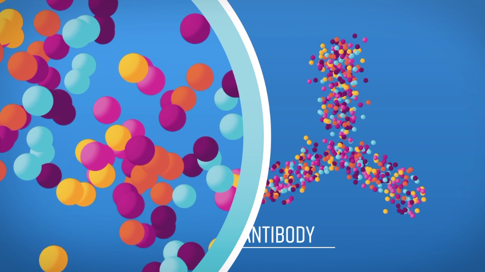 |
REALISTIC ILLUSTRATIONTED-Ed—How does your thyroid manage your metabolism? This video covered specific anatomical and scientific topics, so a somewhat realistic approach (without being too realistic) made sense. | SIMPLE OR ABSTRACT ILLUSTRATIONRational360 and the Global Alzheimer’s Platform Foundation: This video was more about what people can do in their everyday lives to try to prevent Alzheimer’s. So simplifying the visuals in order to appeal to a broad audience was the better choice. | 3D & ANIMATIONAvalere & the American Cancer Society—Biologics & Biosimilars: Many medical topics go into detail on things we can’t even see with the naked eye. 3D and pseudo-3D art helps bring the invisible interiors of our medicines and our bodies to life. |
Breaking language barriers?
Many infographics can be translated to increase usefulness across various locales. We’ve localized projects for French, Spanish, German, Hebrew, and many other audiences. Videos are easily subtitled. That said, some infographics can heavily rely on visuals and minimize the use of words. But to be honest, this is actually quite difficult.
Everyone can understand sequential visual processes when it’s something like IKEA furniture instructions, but this approach fails for more complex or subtle communications. The truth is that it’s the combination of pictures + words that make infographics so powerful. The sum is greater than the parts when it comes to visual storytelling.

Doctor’s orders
Remember, 9 out of 10 doctors recommend using Tremendousness infographics to communicate important health-related messages in a clear and compelling way.
OK, that’s not true.
What is true is that good visual storytelling has the ability to simplify complex messages and make abstract concepts concrete. Studies have shown that after three days subjects could only recall 10% of the information that was presented to them in text alone, but were able to remember 65% of the messaging when the text was presented with relevant visuals.
Sure, there are always a variety of factors that influence learning—but no matter I’d call that a healthy advantage.
