From start to finish—Part 4: The illustration
Being a side project, we fit the work for our tribute to the Gateway Arch in whenever we could. We’d started at the end of last year, so weeks and even months would pass with no progress. But back the spring Bill brought a pile of sketches to a creative meeting. he explained how each worked, what he thought the strengths and weaknesses were, where he was stuck, and what he was trying to do overall. We knew we were producing a large format poster. All of us batted the sketches around, beat them up, and made adjustments to the mess of printouts. Finally, we were making visible progress. When the blueprint was ready it was my turn to illustrate.
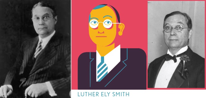
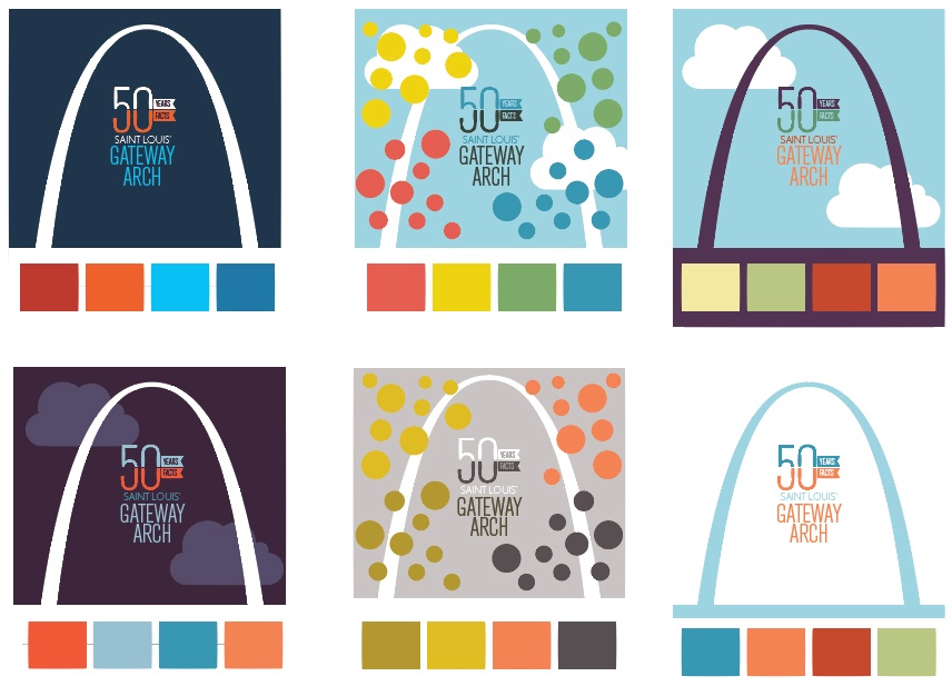
Portraiture was fun to interpret—there were more than a handful of folks to render but they’d be surrounded by architecture, objects, and technology. This was an exciting couple weeks of illustration. Also below is a color study—as you can see, the palette was in flux for a while and even changed once all the illustration was finished. This is typical for my process, but not recommended as the most efficient best practice.


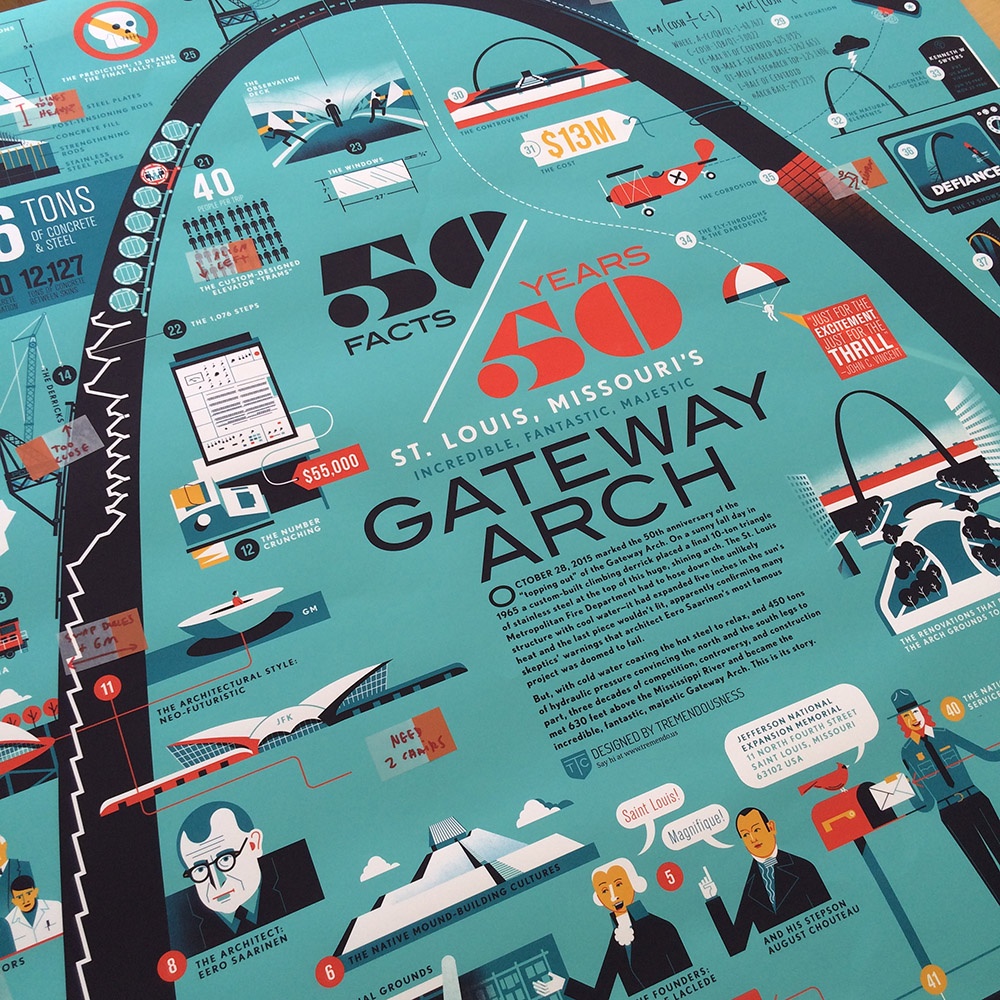
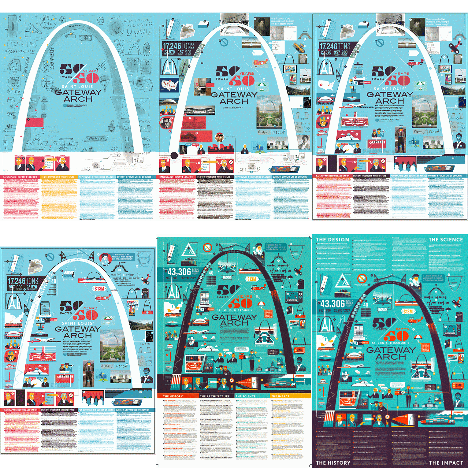
After much internal deliberation on the stylistic approach, we decided a geometric, minimalistic, vector style. I feel like it’s a nod to mid-century aesthetic, but brings a contemporary update to it. I have a personal affection for MCM (and even moved into a brick home from the same era). The potentially overwhelming density of the piece is offset with simple, iconic drawings representing each of the 50 facts, distributed evenly. The animation below shows the poster’s progress, including a downsizing from 36×48″ to 24×36″, after seeing just how enormous the larger size really was.
At the very end we struggled to deal with the amount of text we’d included. It had always seemed burdensome and the issue felt like it became a real problem when we refactored the dimensions. In the end, Bill made some adjustments and we ended up in a pretty good place—a poster that’s both beautiful and packed with interesting information.

Now, off to the printer!

