Every infographic is built around one of three visual frameworks
Frameworks are like an infographic’s skeleton—they’re not always visible but they provide critical support nonetheless. Think of a framework as the visual architecture that holds a story together, helping you to explore, arrange, and communicate information. They determine the organization of content in infographics, giving visual maps and stories—even ideas—structure.
You may or may not have heard of frameworks in the context of information design—and we certainly didn’t invent them. But it’s generally agreed that there are three main types. Once you understand the basic concepts, you’ll start to see them everywhere. Even at the napkin sketch level, they help clarify thinking and generate new ideas. In fact, the famous Southwest Airlines napkin sketch is essentially a bare bones system framework visual (with a splash of process implied).
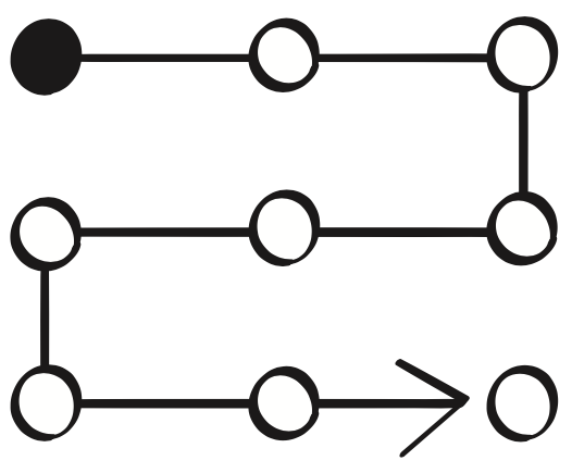
Processes
 Processes come to life in linear, circular, and multi-path formats in which meaning is derived from order.
A Process visual’s key strength is answering “How…?” questions. How do you get from A to Z? Also, how many steps are involved and what are they? What are hurdles we may encounter? How long and arduous is the journey? What’s the flow?
This framework is good for explaining how stuff works. Where are we going and how do we get there? What comes first and what are the steps? IKEA instructions essentially are a minimalist process framework explaining the sequential steps to put together a piece of furniture.
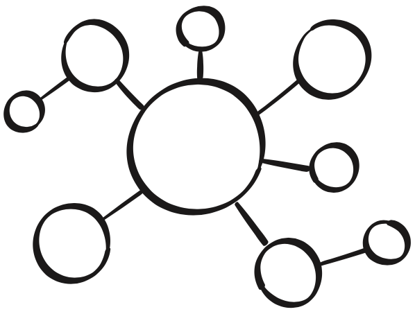
Systems
 Systems manifest in a centralized layout (hub and spokes) or a decentralized setup (interconnectedness) in which meaning is derived from individual properties and the spatial relationships amongst them.
Systems help explain “What…?” questions. What does the big picture look like? How do the pieces fit together? These frameworks help to show interdependencies within (or even outside of) ecosystems and networks.
Fundamentally, they show the big picture, the little pieces, the relationships, and how all of that fits together. The Periodic Table is a system framework showing the relationships of elements to one another.
Comparisons
 Charts, stats, and data visualization fall under the Comparisons umbrella. Meaning is derived from an emphasis on differentiation and/or commonalities.
These frameworks are good for explaining “Why…?” questions. Why choose X? Why change? Where are we today? What does that look like? What are the inherent complications? Then the flip side: Where will we go? What does that look like? How will it solve today’s problems?
More story-based visuals can compare good vs bad, old vs new, pain vs gain, now vs then, us vs them, etc. A product feature matrix or the “compare these products” tables on e-commerce websites like Amazon are (quite obviously) Comparisons.
Wait, there’s more…
An appropriately-used Process, System, or Comparison framework is at the core of every effective infographic, supporting its content in just the right way. It’s common for different visual metaphors to be layered on top of the framework to convey the right emotional, situational, or technical feel. Here are three examples, all using a building metaphor, or visual “skin”.

- A “how it works” Process map explaining the stages of the construction of an office building might show a sequence that goes from empty lot to finished building. It first depicts the plans, then the foundation being dug, then the floors building upward, then the finishing touches being added. The end result is the completed office/business building in use.
- A “what we do” System infographic for the business that occupies that building might map out the floors, employees, and equipment, shown in a cutaway so you can see inside. The visuals depict what happens where and who does what, even how.
- A “why we’re better” Comparison visual could show both that business’s competitor, failing their customers, and your business side-by-side. It could highlight the strengths, features, and benefits of your business’s product/people/processes over the weaknesses, flaws, and downsides of the competitor’s.
These examples hint that the three frameworks are not mutually exclusive, nor are the kinds of questions they can answer. In fact, frameworks frequently are combined and can come to life in many ways. There’s a nearly unlimited supply of potential visual vignettes and overall “skin” metaphors that can make that possible, allowing you to personalize each story in just the right way.
Visuals: sketches by W. Scott Matthews / Tremendousness.
