Design systems vs Algorithmic systems
The curious case of the MIT Media Lab’s branding experiments.
We all know what a “logo” is. Most of us can define “graphic design”. Many people might even be able to explain what “branding” means. But what about “design systems”? What, exactly, is a design system?
A “design system” is a set of repeatable design components meant to enable the management of design projects—with consistency and at scale. This includes defined standards that guide the use of the various components, for example, and how they can be reused in different combinations.
In a design system, a human has created or manipulated every aspect of the design project—for example, variations on a logo, signage, underlying grids, the use of photography, icon illustration styles, or other components and deliverables. These systems usually are based around a cohesive design concept, and are visually coordinated by recurring motifs or contain certain pertinent elements crucial to the success of the system. Things work together, and future design problems usually have solutions built in to the guidelines and standards.
Because these systems are usually formed from defined rule sets, different designers can create a clear, concise, consistent system. This underlying system serves the purpose of creating predictable and recognizable delivery of information or identifiers.
Alternatively, an “algorithmic system” is a design system in which basic rules are set up by designers, and these instructions are interpreted programmatically, by software. The program then generates visuals based off of that set of rules.
Algorithmic systems often are fully automated, resulting in unique and possibly unexpected designs. When these systems are leveraged in design often it is to create a fluid or ever-changing identity. These identities sometimes are not held very tightly together by concept or meaning, but instead maintain an identity based on key attributes or rules used to create the system.
When creating any design system, several things are crucial for success: the ability to be easily recognizable, clarity, and the delivery of information (if necessary).
If the goal is solely a varied yet visually connected identity, an algorithmic system is great at outputting a vast amount of iterative, generative results, culminating in a fluid and dynamic system with minimal effort to produce said results.
If specificity and clarity of information is crucial, nothing beats the output of the creative, logical human mind designing the results. Although people can create a great deal of output, the time requirements to ensure quality and clarity often can be costly and inefficient.
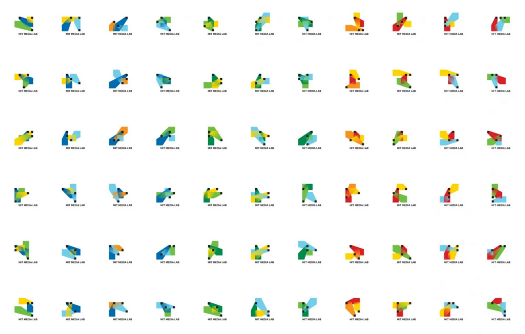
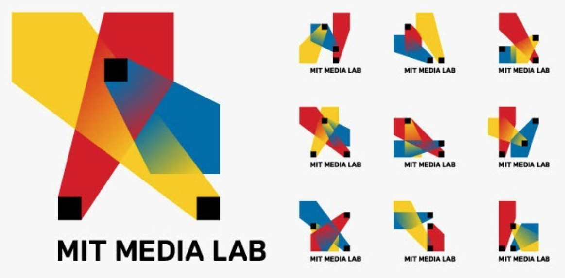
An algorithmic system: MIT Media Lab’s 2011 logo
One of my favorite examples of the difference between design systems and algorithmic systems comes from the smart folks over at MIT Media Lab. The Lab’s 2011 brand redesign was fresh, innovative and… a bit confusing. It was based around a logo randomly generated based on certain pre-programmed parameters. This resulted in a system seemingly devoid of actual meaning—but visually interesting and conceptually a very cool idea. Every person’s business card had a different algorithmically-generated permutation of the logo, yet they all… looked the same, and to what end?
“What made it work—that any one of the 40,000 variations could stand for the Media Lab, that they were all equal, in essence—also was biggest challenge.”
—Michael Beirut, Pentagram
A design system: MIT Media Lab’s 2014 logo
So apparently a cool idea is not cool enough, though. In 2014 MIT Media Lab commissioned famed design studio Pentagram to create a new identity for the institution’s 30th anniversary.
Ultimately, Pentagram successfully captured the radical nature of the previous system’s generative constructs, but did so in a manner that gave meaning and purpose to what—at a glance—appears to be digitally scribbled chaos.
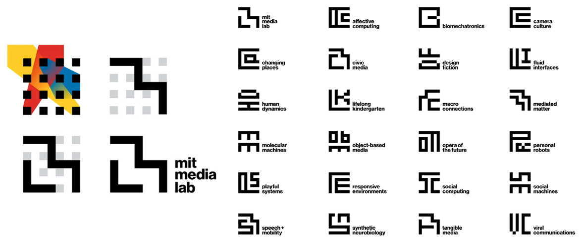 The new design system is comprised of a 7×7 grid (the same used by the previous generative logo, in fact) meant to both define and contain a department’s initials next to a typeset wordmark. This resulted in a varied but cohesive system that looks nearly random—but actually makes sense. Along with the grid, the typeface used was reverted back to Helvetica, which was historically used in all of their internal communications starting in the early days of the organization. When viewed together they create patterns and intricate maze-like grids and constructs that appear “generative” while maintaining a minimized yet important purpose.
When creating large-scale design systems, it can be challenging to find a balance between beauty and utility. The old algorithmic system leveraged machines to do what they often used for: replacing human labor. When properly set up, a system like this can be infinitely engaging and interesting to look at, but at its core often lacks meaningful visual information and humanity.
So which is better?
MIT Media Lab’s identity projects exemplify the careful balance of design vs. function. One was generated by machines guided by rules, the other was hand-designed by people guided by standards, and both have strengths and weaknesses.
It’s often the case that an algorithmic system can be just as good if not better looking than a designed system. But when useful meaning of the information and design elements in a design is lost, the result ultimately becomes more of a whiz-bang technological exercise rather than the effective brand and communication tool most organizations need.
Editor’s note: We were originally going to publish this a few months ago, but the news of the Media Lab’s scandalous connection to Jeffrey Epstein caused us to set it on the back burner. Ultimately we decided that because the content is so very tightly focus on design, we should just go ahead and share it.