Complexity shouldn’t be complicated
The challenge
We live in a world layered with complexity and ambiguity. If 2020 taught us anything, it was in revealing the interconnectedness of the complex systems that govern our lives for better or for worse.
We also began to see the flaws of “less friction” and “move fast and break things.” Complexity is not a bad word. Complexity is where the suitable answers to a juicy problem lie. Or, as I like to say, friction is where the fire is.
What isn’t ideal is complication. While complexity makes things work, complicatedness can do just the opposite. The challenge in creating understanding is to take something complex, and unpack it in a systematic and memorable way so it can be shared, replicated, and scaled.
This complexity may be in the form of an new initiative or change, an updated product or process or plan, or any number of organizational imperatives that require broad understanding, collaboration, and motivation. Any good comms piece should know its audience, its intended effect, and anticipate and answer the kinds of questions it might inspire in order to translate that complexity into useful information.
 When asked what the strategists here at Tremendousness do, my default response is that we take complex information and do precisely that: we define the audience and the goal, then anticipate and answer key questions in a systematic and memorable way. In other words, our secret sauce is that we package complexity into coherent visual containers.
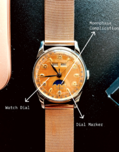
I recently read this piece in Hodinkee about watch dial designs. Despite the trend for luxury products in other verticals to lean towards minimalism, mechanical watch dials have remained a reasonably busy palette. Yet, it’s an excellent example of an industry embracing complexity but not making it complicated. This is ironic because additional features on a mechanical watch, e.g., date window, perpetual calendar, etc., are all called complications.
That got me thinking; the thought that goes into a feature-rich dial is a good representation of how we think about the synthesis and packaging of complex information into digestible, visual nuggets here at Tremendousness.
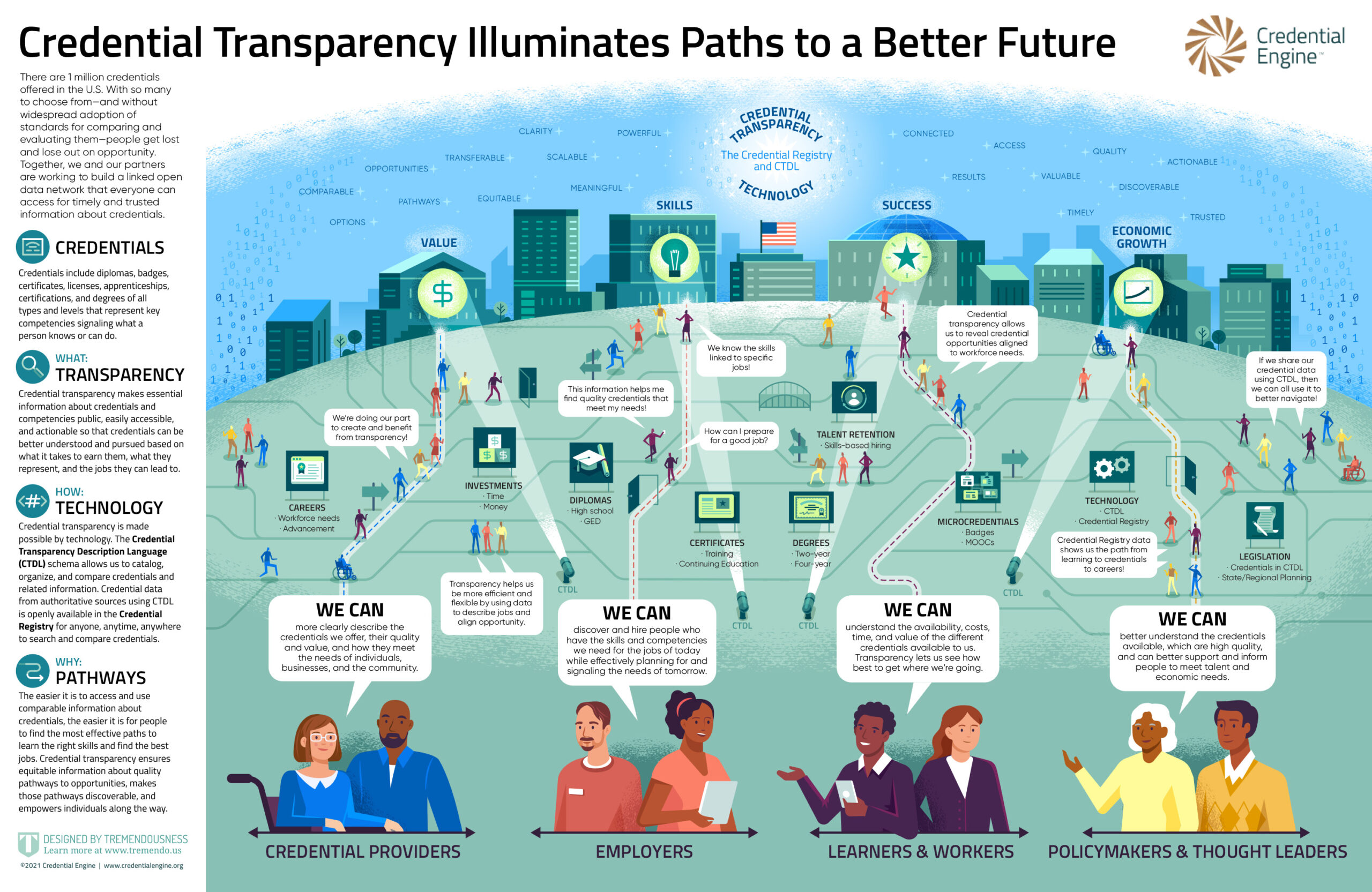
Let’s set the table with our visual aids for the purpose of this piece. Above we have a dress watch with some key features called out: the watch dial, dial marker, and a moon phase complication. Below is an infographic we made for a client earlier this year.
The framing of key elements
One of the more critical things we do in the discovery phase is framing. As the consulting cliché goes, we try to put a lens on the information so we can contain and present it in a way that makes the message resonate.
In a lot of ways, framing is like the watch dial itself. A dial is a contained space within which multiple critical bits of information need to be communicated. The spacing of dial markers, where text is placed, and how the array of complications are laid out; all set the tone for how easy or difficult it is for the wearer to experience the watch.
Now let’s look at the infographic. This visual story above was created to show how credential transparency helps people accomplish their goals. Credential transparency is the ability for learners, educators, policymakers, and others to understand what an education or training credential such as a diploma or certification contains, means, and enables you to do. There are millions of credentials and many more millions of people involved, so the story is inherently complex. Organizations like Credential Engine are working to create “a future where millions of people worldwide have access to information about credentials that opens their eyes to the full range of opportunities for learning, advancement, and meaningful careers.”
In this case, the framing clearly shows three key elements:
- Stakeholders—each with their own “We Can” statements—have access to…
- Education pathways that offer choices and lead toward…
- Desired results—the impact credential transparency could have on millions of Americans.
Both artifacts have a lot of complex information to communicate in relatively small spaces. Both artifacts leverage good design to express that in an efficient and non-complex manner.
The audience, outcome, and answers
The foundation of a watch is its movement. Often hidden from view, a mechanical watch movement is a marvel of engineering that powers what seems so effortless on the surface. Gears, balance cocks, jewels, and many other minute details come together to drive what is seen on the dial.
Likewise, the foundation of what translates as a slick, compelling information design artifact is the result of the deep, diligent work put into the structure of the credential transparency piece. It was imperative that we identify our audience, what we want them to do when they see the artifact, and what questions we anticipate needing to answer for them. You can’t include everything, of course, because that complicates things. Instead, these guiding principles helped to create a complex but compelling infographic and animated video.
In this particular visual story, the ‘who,’ ‘what,’ ‘how,’ and ‘why’ are not just embedded into the illustrations themselves, but are also summarized to the left to add detail and to reinforce those points in the audiences’ minds. A good dial doesn’t make you search too hard for the day and date. And a good infographic doesn’t bury the headline, either. But both require you to peruse a bit of complexity to get multiple quick and clear answers. Something you get at a glance (and writing is design too, remember that) and some information requires a deeper dive.
The messaging and tone
The flourishes on a watch can come from several things. It can be as simple as the lume; for others, the difference between a ceramic versus a steel bezel, or the merits or a guilloche over sunburst dial. In the end, these semiotics are all one’s way of projecting the personality one chooses to embrace and embody.
Messaging can define the flavor of an artifact. This infographic had to be neutral, informative, and confident. The style of language used reflects that. It’s also present in the visual style itself; fonts, color palette, and choice of iconography.
In the end, messaging and tone help all of our clients achieve the goal they have in mind and couple it with their strategic intention, whether it’s purely informative or trying to achieve alignment and buy-in.
The conclusion
What’s my point? Don’t automatically circumvent complexity. Instead, corral it. Contain it. As creatives and consultants, we have a sacred duty to to embrace complexity and leverage our skills to frame and communicate it in ways that people can understand. We also work to cultivate the habit of being comfortable with complex, ambiguous, and nuanced information. Our role is to make our customers’ stories less complicated and more understandable—not to simplify them to the point of uselessness.
The amount of complexity involved in actually making something like credential transparency technology work is staggering, but the amount of information needed to convey its benefits can fit on a one-page infographic. As Einstein said, “Everything should be made as simple as possible, but no simpler.” Things should be dialed back, but they still need to carry the weight of the information.
Ours is a world where dumbing information down to “frictionless absolutes” or memes is both easy and expected. But we prefer to take inspiration from the mechanical watch; we own being complex, and we deal with it by leveraging the language of design to create coherent visual containers for our clients’ stories.
Image: feature illustration by Maddy Mueller, watch diagram by Ari Abraham, infographic by Tremendousness & Credential Engine.