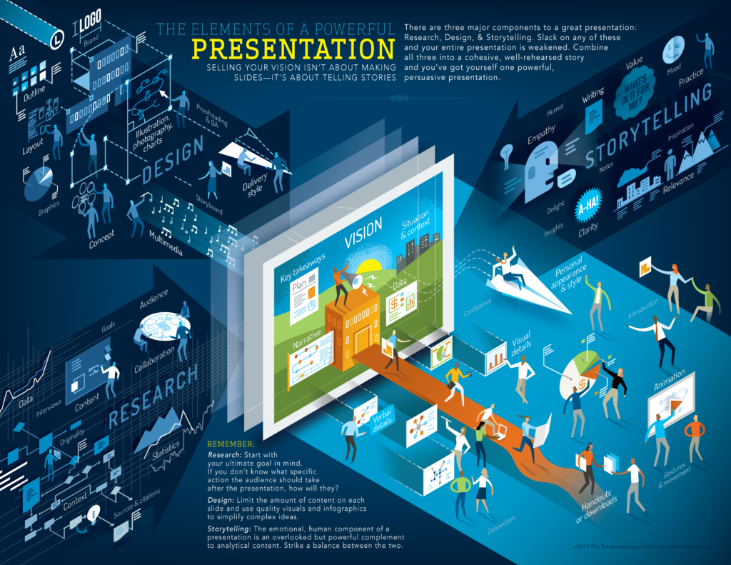
The elements of a powerful presentation
Describing your big vision or telling your company’s story might seem simple—but don’t be fooled, grabbing and holding people’s attention requires a solid balance of research, storytelling, and design. Slack on any of these and you might be wasting a valuable opportunity. Combine all three into a cohesive story and you’ve got yourself one powerful, persuasive presentation.
 Great stories happen to those who can tell them. —Ira Glass (and here’s Ira Glass’s wonderful four-part video on storytelling)
 Start your presentation off with a foundation that’s built upon RESEARCH. What problem are you solving for? Put yourself in the shoes of your primary audience. Why would they care about what you had to say? How is your solution going to change the way they do things? Is there data to back it up?
I know, that’s a lot of thinking but you need to make sure that your story is informative AND relevant to the people you hope will listen.
Okay. Now you know who you are talking to and what you want to say. Next you need to think about how to unfold your story.
 STORYTELLING is about engaging your audience and making them care. Sticking to the facts isn’t enough. Use anecdotes and metaphors to bring your vision to life. Be a storyteller! I know you’re thinking “But I’m in a conference room, this doesn’t relate to me.” Well, Robert McKee—one of the foremost creative writing instructors—would disagree.
Businesspeople not only have to understand their companies’ past, but then they must project the future. And how do you imagine the future? As a story. —Robert McKee (here’s his Harvard Business Review interview on ‘storytelling that moves people’)
Here are a few simple things for you to think about. What’s the big picture? Who or what is the hero of your story? What obstacles stand in the way? Talk about a journey in terms of opportunity (beginning), overcoming conflict (middle) and a positive transformation(big finish!)
Make sure you end with a clear call to action so your audience understands what they should do next.
Lastly, DESIGN should enhance your story, not distract from it. Keep headlines short. Avoid complex imagery. Keep word count to a minimum. Use simple charts, drawings and photography that will complement your talking points. Design is just as much about what you leave out as what you put in so edit, edit, edit!
 There are three responses to a piece of design—yes, no, and WOW! Wow is the one to aim for. —Milton Glaser
Never overestimate your audience’s attention span.
Whether it’s a video, a PowerPoint, or an infographic, powerful presentations are more than just pie charts and stock photos with pithy quotations—they’re about telling a real story that connects with your audience.
Because when it comes down to it, everything is a presentation.
