Using live sketching to capture “critical moments”
By Ted May (alum)
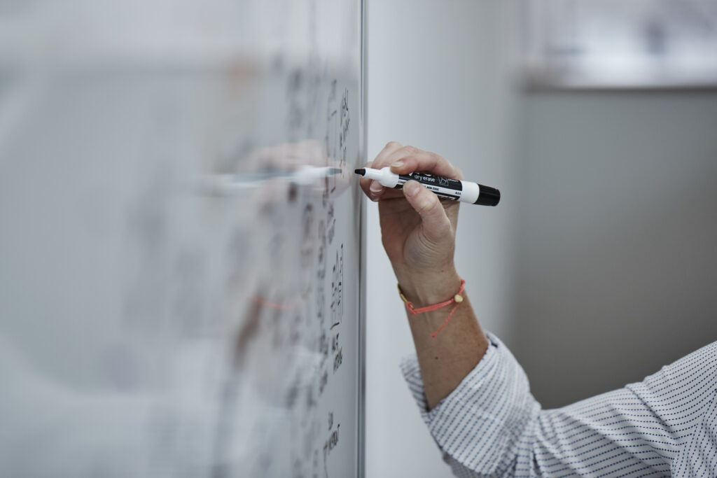
When we sketch live in a workshop setting, whether in-person or online, one of our main goals is to visually capture the information that bubbles up in conversation between facilitators and client groups, and to fuel the evolution of new ideas and alignment. We want to produce an artifact that anyone can quickly understand. So how do you do all of that, live, in the moment?
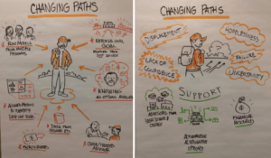
One good example is when we collaborated with Bain & Company on a workshop with a group of New York City charter schools. Recent alumni from the schools were present at the workshop to share their experiences post-graduation. The Bain team was looking for “critical moments”—times when the students needed support—along with which solutions worked and which didn’t. Tremendousness’s task was to visually capture each of these critical moments.
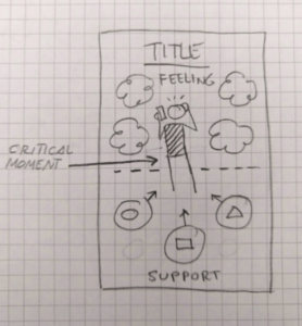
Prior to the workshop, we knew the Bain team wanted for each critical moment to show what the student felt at the time, and what kind of support they received or could have used. With this in mind, I designed a simple sketch layout large enough for everyone to see.
The trick to doing this kind of capture is to design basic visual architectures in advance so you can create and capture content on the fly. When working with a potentially open-ended visual capture, it’s often best to work from the center out. You create your anchor visual in the center of the poster—in this case, our critical moments—and populate the surrounding area with supporting information captured as smaller vignettes, icons, and labels.
 This center-first layout achieves two things. First, it’s very simple—which is a must when you’re sketching live and time is of the essence.
Second, it’s flexible. With a central anchor, you don’t need to worry about lining things up to an imaginary grid. Things just fall into place and you can almost always find a little gap somewhere to squeeze in that key last-minute idea.
During the actual live sketching we used color to further distinguish between the Feelings and Support sections.
Once these critical moments were captured, they were used by the facilitators to assist in brainstorming what the ideal future state for each of these moments would be. We captured these as well using a similar center-first layout to create a matching pair of current/future visuals. Post workshop, these visuals will be used as a capture of the experiences and ideas that were discussed and enhance the process of improving these critical moments for students.
Capturing information visually is all about speed. And being clever without being too clever. When I’m live sketching, the mantra I repeat to myself over and over is “keep it simple”. In this particular workshop, the pre-planned, center-out framework enabled me and my colleagues to focus on listening to the client team and drawing the core visual content—capturing those “critical moments” so they can be understood and acted on.

