Introducing “charm” into visual storytelling
 By Maddy Mueller (alum)
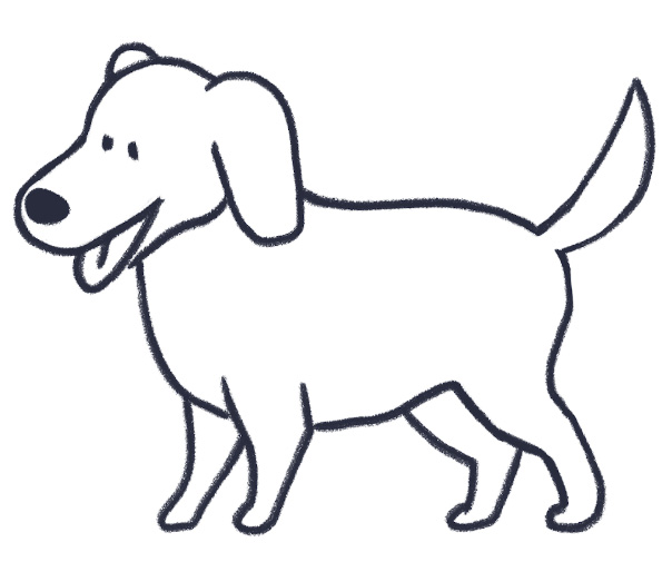
When I was in college, I was tasked with drawing a dog as part of an assignment. Every day, I would bring a slightly different dog drawing to class—and every day, my professor would frown at my work and tell me I needed to redo it.
She said she felt like she’d seen the dog before in a cartoon or movie; my drawing was too “general,” and I needed to make it more “specific.”
At the time, I didn’t understand what my professor was after. After all, I was supposed to draw a dog, so I drew what was obviously a dog: four legs, tail, snout, tongue. But after a couple years of experience, I’ve started to understand what she was talking about.
It’s not all that difficult to make a drawing that communicates a simple concept. You don’t have to be an artist to do it—if you tell any random person to draw a horse, for instance, they’ll likely come up with a picture that communicates “horse,” even if it isn’t pretty. We all have a memory bank filled with generic, general versions of objects, gathered from years of experience looking at the objects and representations of them. But my professor’s point was that good illustration comes from not only making a drawing that communicates an idea, but also makes that idea memorable.
This usually isn’t an easy task, especially when the ideas you’re trying to communicate get more complicated than “dog,” like they usually are here at Tremendousness. Nonetheless, there are a lot of ways to make a basic illustration hit harder. Scott Matthews and I have called this giving a drawing “charm.” This means pushing a simple or generic concept by making it funny, giving it a narrative, or making it specific by adding unique details and features.
For instance, to illustrate “Since tech and finance combined, Shanghai has gone cashless,” you could draw this:

Or you could draw this:

Which is more appealing and memorable?
Of course, it’s important to remember that there’s a time and a place for “charming” illustrations. Sometimes what’s needed for a job is the fastest read possible, which can mean abandoning the funny and detailed for the generic and iconic. Sometimes a “cartoony” tone just isn’t appropriate.
Striking the right balance between clear and interesting can mean the difference between an idea that’s forgotten and an idea that’s remembered.
Images: drawings by Maddy Mueller / Tremendousness.
