From start to finish—Part 2: The concept
Part II of V: The concept
With a general idea of what we wanted to say—and specifically to get a good deal of discrete, lesser-known Arch facts into the piece—I began doing rough napkin sketches. This is usually the first visual phase of any project. You’ve got to capture a variety of rough ideas, iterate quickly, and share them with others. If I’m not using actual paper, I use Fifty Three’s ‘Paper’ app on the iPad. There are lots of nice choices out there, but it’s the least complicated drawing app that still maintains a finesse and a quality to its output. Others do more and are correspondingly difficult to understand, and others do less and provide a lower quality look. Paper is my Goldilocks.
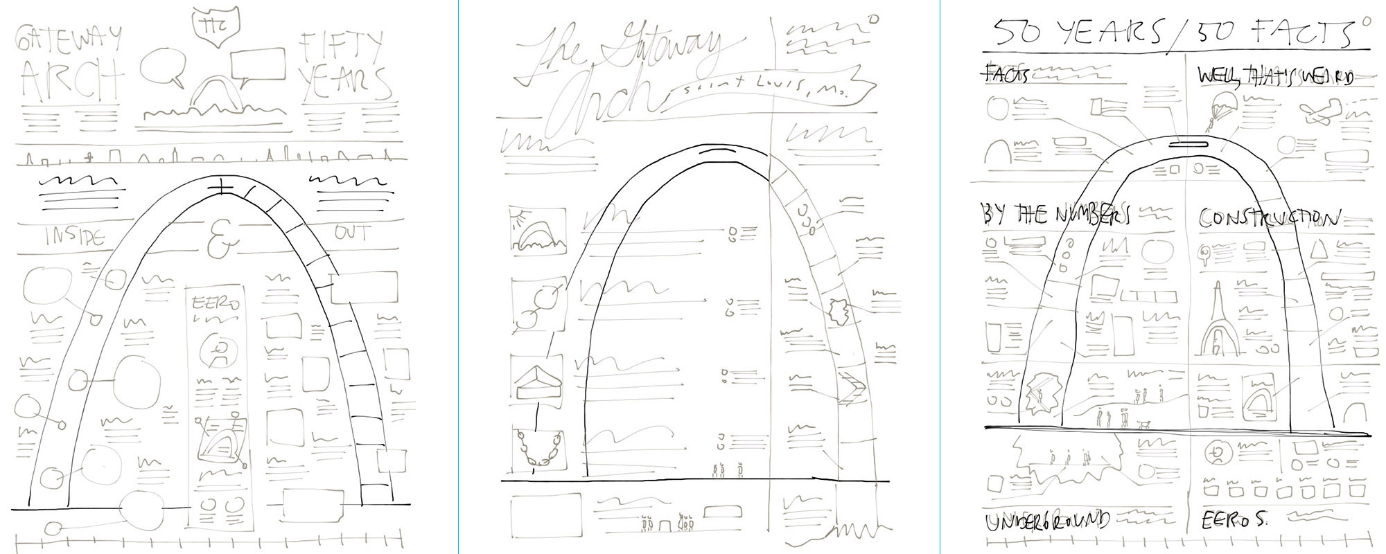
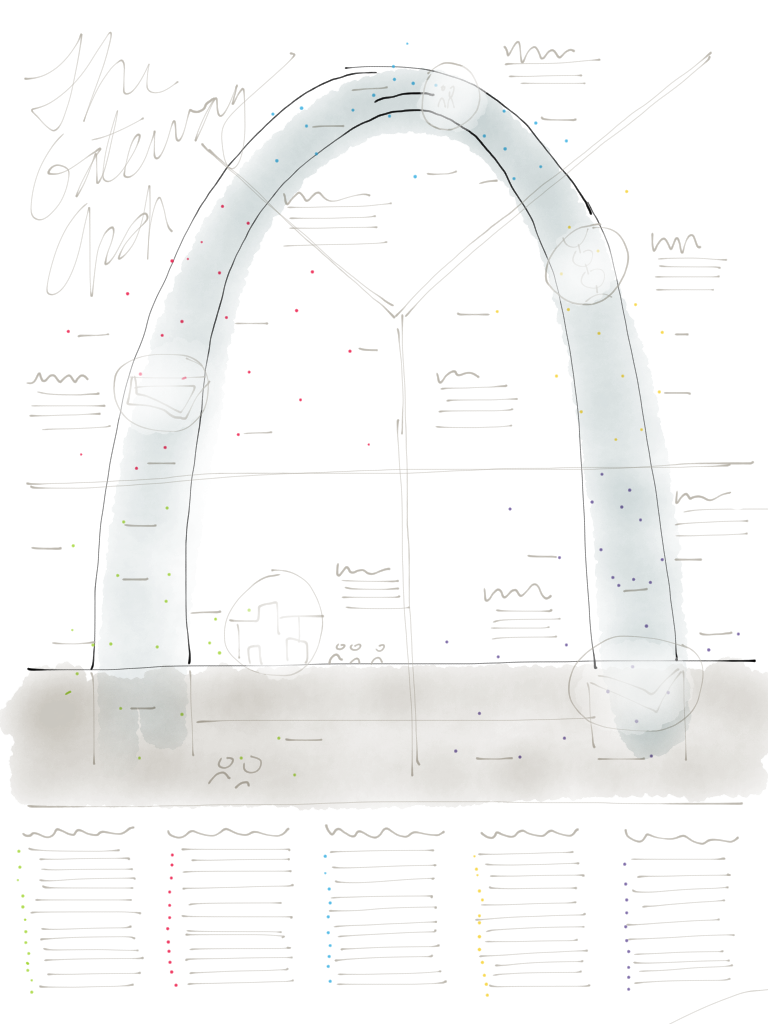
Above, L-R: an approach detailing facts about the Arch organized inside vs out; a callouts and cutaways approach; breaking the content down into big buckets. Below: another version that breaks things down into big buckets, but in this case we separate the bulk of the text from the visuals. Click to view larger.
Having done a good deal of research (and continuing to do more throughput the process), I sketched / scribbled a great many little napkin sketches. The act of doing and organizing that research had begun to allow my brain to start painting the content in broad strokes, and to imagine the many ways we might categorize the information to give order to the story. I had written a great deal and things weren’t 100% solid yet, but having real content allowed me to sketch with purpose.
The truth is, I don’t have any amazing, new, ground-breaking concept-stage process insights for you. The simple fact is, whether you use paper or Paper or something else, starting with rough, hand-drawn concepts is essential to the speed, iteration, and sharing needed to get a visual project rolling and to exploring options. One big thing to look out for is the fact that it’s really easy to simply scribble a few wavy lines for text, then realize the actual amount of copy far exceeds your minimalistic hopes and dreams. The fact that I had written a draft of the copy helped a lot in trying to be realistic about having plenty of words to go with plenty of pictures. Of course that lead to some pretty dense sketches, which we’ll work through in the next post, Part III—the design.


