Illustration is not just decoration
A brief history of illustration
It’s easy to get academic about the history of illustration, but there are already plenty of other people doing that better than me. The important point is that since before written language, humans were painting in caves to communicate with each other visually.
So let’s fast-forward to the 19th and 20th centuries when advances in paper making and printing techniques allowed newspapers, magazines, and illustrated books to become the dominant consumer media. Publishers realized that commissioning artists to create visuals for their covers and to accompany articles helped sell subscriptions and increase advertising revenue. Illustration became a part of daily life as books, magazines, newspapers, and catalogs were enjoyed by millions of people as affordable entertainment and sources of information.
An engaging visual piques the interest of your audience. By combining images with your narrative, you’re letting your audience use multiple senses to digest your content. In business, we use illustration for education (through presentations, infographics and animations), to build an identity (branding assets, logo design, and product packaging), as commentary (editorial), and as a tool for persuasion (articles, advertising, point of sale).
According to Fast Company if you want your audience to recall your message, they need to engage with your content and commit it to memory. As humans, it’s far easier for us to remember stories, than a bulleted list of facts–and illustration facilitates that process.
Dictate through design
Certainly, I believe that pictures are far more interesting than a solid page of text, but you don’t have to take my word for it. There are many respectable claims of how compelling visuals improve audience retention and comprehension.
So, great! Pictures are worth a thousand words, but why would you use illustration over a nice photo? When or why is illustration more appropriate? There are others out there that could help you debate which imagery is right for you. I do love a good photo with a spot-on caption. But that’s not always going to help you explain the nuances of your product, service, or process. An illustrated infographic can be a cost-effective way to customize the message to tell the your specific story, while avoiding the trap of using cliched or copyrighted images.
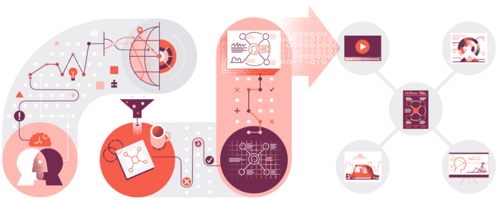
Illustration gives you complete control over the tone, color palette, and image content while encouraging greater user interaction and exploration. Photos with people can evoke emotion, but you’re also showing a specific person, ethnicity, gender, age, etc. Illustration easily avoids that confinement, and can bridge cultural gaps for a global audience. Illustration can also be far more imaginative and metaphorical than a photo alone. Of course, you can also combine illustration with photography to great effect.
But wait—you say you’ve got some pretty serious subject matter and you don’t want to lose credibility? OK, just because you choose illustration doesn’t mean it has to be cartoony or unsophisticated. There are illustration styles for every kind of subject matter and any presentation. Your technical report can easily employ some clean and clear data visualization as a form of storytelling that’s far from Sunday comics.
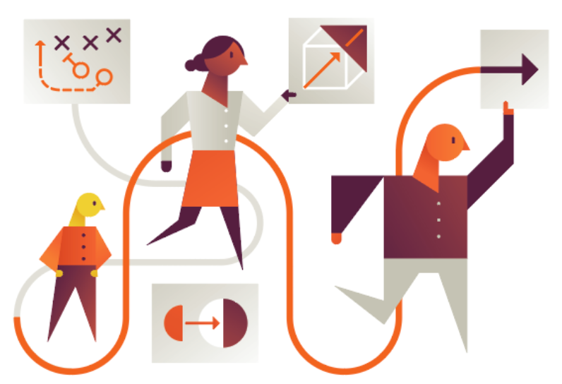
Illustration can be an effective way to express the attitude of a brand in a tangible, easily relatable way, as well as providing countless options for expanding across different platforms.
And illustration can also convey particular processes, or key issues that are important to a brand in interesting, eye-catching ways.
Illustration vs. graphic design
Illustration and Graphic Design are on the same team, but it’s good to be explicit about their differences. I don’t see it as a “versus” kind of situation. Like a quarterback and wide receiver, they’re both integral in leading an audience through content.
Graphic designers are presented with a problem that is solved using a combination of images, symbols and words. They are required to have a good handle on typography and principles of visual composition. They’re concerned with the challenge of balancing visuals with text in the most effective way—and sometimes they even work with text alone. But a good illustrator is an asset to a designer; they lean on them to help an audience navigate dense and otherwise unattractive content. The word “illustration” is derived from late Middle English, meaning “illumination; spiritual or intellectual enlightenment” (thanks, Wikipedia). In this way, the team (graphic designer and illustrator) carries the ball (content) across the goal line (audience comprehension) together. Score!
How can we help you “score” more?
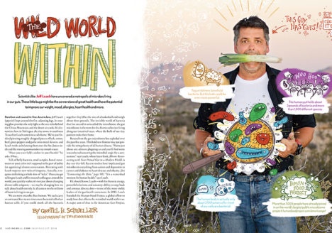
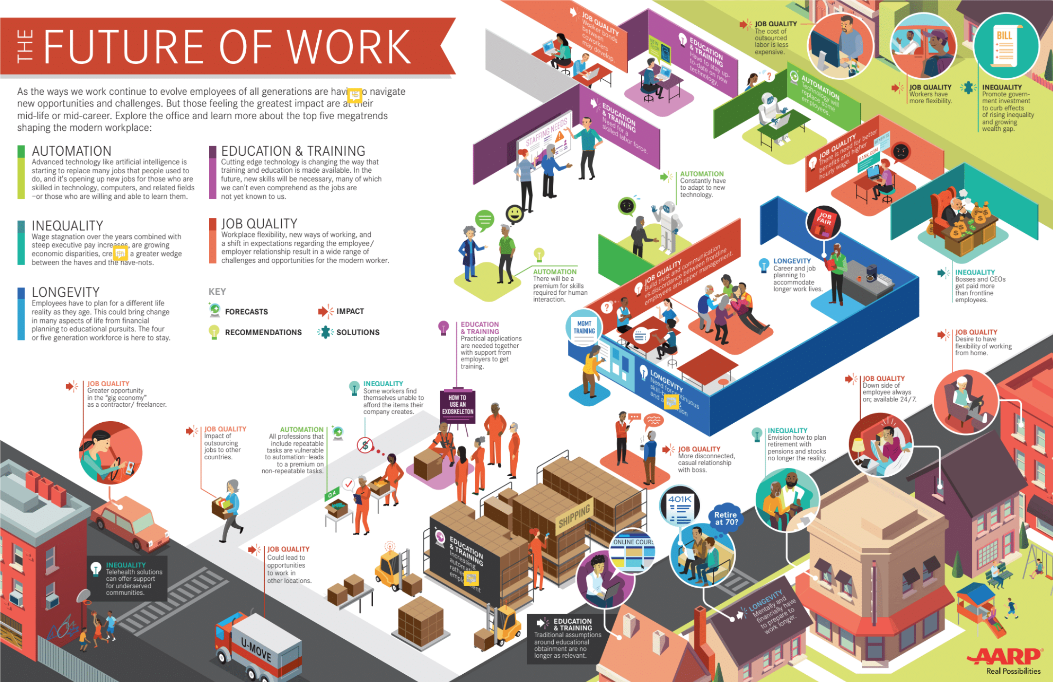
I’ve been crafting illustrations for 20+ years—illustrations that bring clarity and comprehension to pretty difficult subject matter. We don’t always draw zoo animals as anthropomorphic characters—but sometimes we do and that’s what makes us a bit more unique. We create images in whatever style or tone necessary to convey a client’s meaning and maintain brand consistency. We engage the client’s audience to ensure they are attracted to and can comprehend important messages. And we’ve done this across a variety of media: from magazine spread illustrations to animated and static infographics to journey maps…
Back in the “early days” (you know, like 1999) my colleagues and I used our passion for explanation via illustration to elevate the “infographic” space beyond the instruction manual and newspaper charts (which is a quick way to help people understand what I do for a living). The word “infographic” didn’t always pass spellcheck, even though they’ve been in use for hundreds of years (Napoleon’s March, anyone?).
The infographics boom we’ve seen over the last decade or so means they’re not just a novelty anymore—there is a real and proven value in infographics. So the current abundance should not limit the opportunity to create something of incredible quality and effectiveness. Information is all around, data is everywhere, and it’s incredibly exciting and effective to collect, decipher, and distill complex ideas in clear and compelling visuals.
So, what’s your big idea? Let’s draw it together!